generators
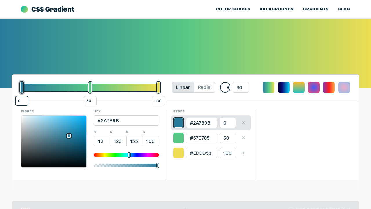
CSS Gradient
The ultimate CSS gradient generator with visual preview and code export.
#gradient#color#background
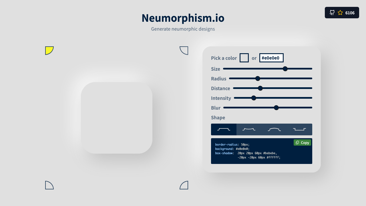
Build CSS 3D transforms visually. Control perspective, rotateX, rotateY, rotateZ, translateZ, and scale with live sliders. The preview card updates in real time so you can see exactly how the transform looks before copying the CSS.
Live preview
transform: rotateX(-15deg) rotateY(20deg)
Perspective controls the depth effect — lower values (300-600px) create dramatic 3D, higher values (1000px+) are more subtle.
RotateX tilts top/bottom, rotateY flips left/right, rotateZ spins in-plane. Combine all three for complex transforms.
Move the element toward or away from the viewer along the Z axis. Works best with perspective set on the parent.
The output includes perspective on the parent container and transform on the child element — both are required.
From our directory of 30+ CSS tools.
Know a great CSS tool?
Submit it to the directory and help developers discover it.