generators
CSS Gradient
The ultimate CSS gradient generator with visual preview and code export.
#gradient#color#background
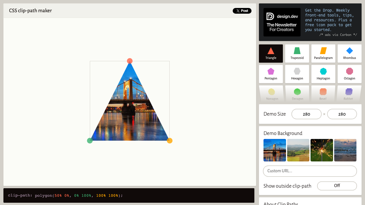
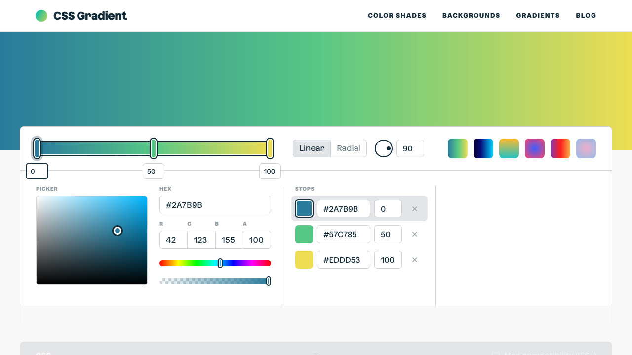
Pick from 14 shape presets — circle, ellipse, triangle, rhombus, pentagon, hexagon, star, arrows, chevron, parallelogram, and more. For circle and ellipse shapes, fine-tune radius and centre position with sliders. The live preview updates instantly, and the output includes both the standard and -webkit- prefixed declarations.
Shape Presets
Live Preview
Selected: Circle
Adjust Shape
clip-path value
circle(50% at 50% 50%)Click any shape preset button — Circle, Triangle Up, Star, Hexagon, Arrow Right, and 9 more.
For Circle, adjust radius and centre X/Y with sliders. For Ellipse, control both radii and centre position.
See the clip-path applied live to a 260×260 gradient square. The shape updates as you change parameters.
Hit Copy CSS to get both -webkit-clip-path and clip-path declarations with full browser support.
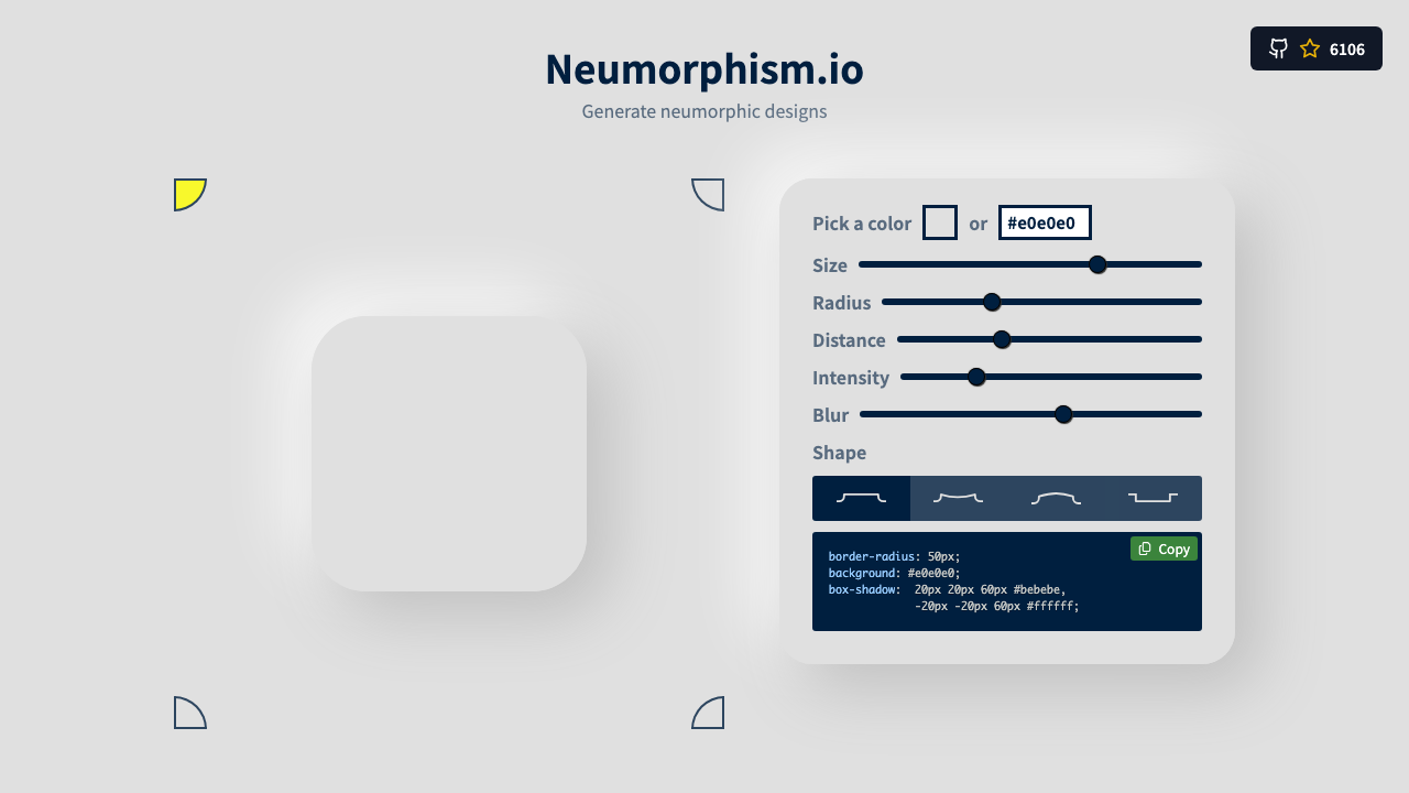
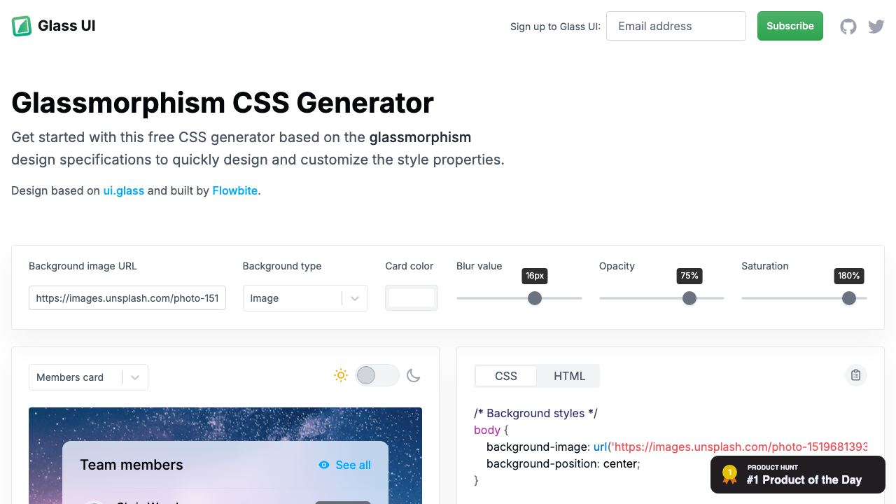
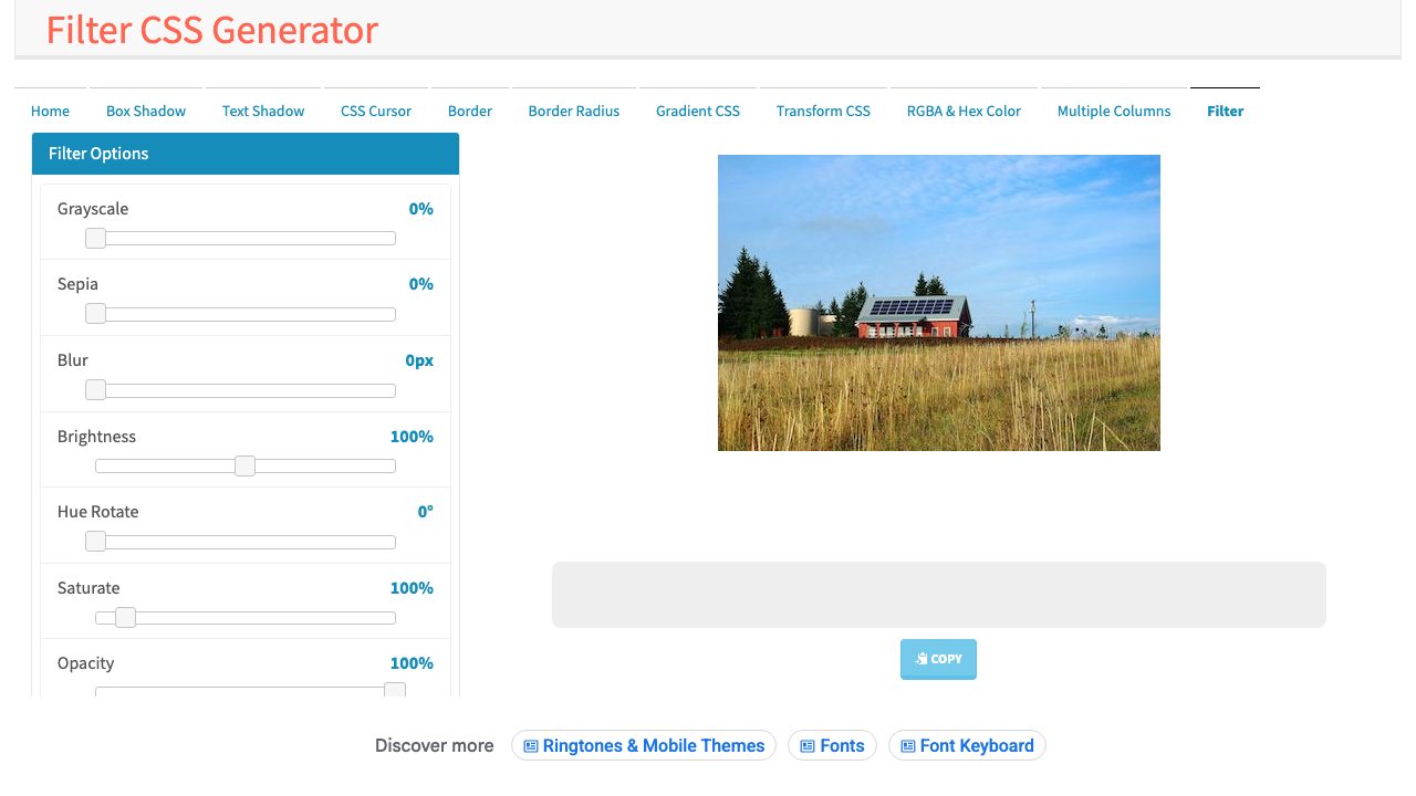
From our directory of 30+ CSS tools.
Know a great CSS tool?
Submit it to the directory and help developers discover it.