generators
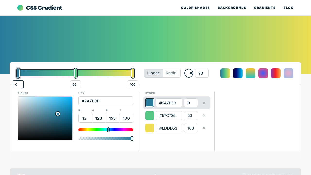
CSS Gradient
The ultimate CSS gradient generator with visual preview and code export.
#gradient#color#background
Build @media rules by combining conditions — min-width, max-width, orientation, prefers-color-scheme, prefers-reduced-motion, and more. Add multiple conditions with AND logic, or build separate breakpoint sets. The output shows both the @media rule and a ready-to-use CSS block.
Conditions
Generated @media rule
Toggle which conditions to include: min-width, max-width, orientation, dark mode preference, and more.
Enter pixel values for width conditions. Select orientation or preference values from the dropdowns.
All active conditions are combined with 'and'. Use the breakpoint presets for common responsive targets.
Copy the complete @media rule with a placeholder CSS block ready to fill with your declarations.
From our directory of 30+ CSS tools.
Know a great CSS tool?
Submit it to the directory and help developers discover it.