generators
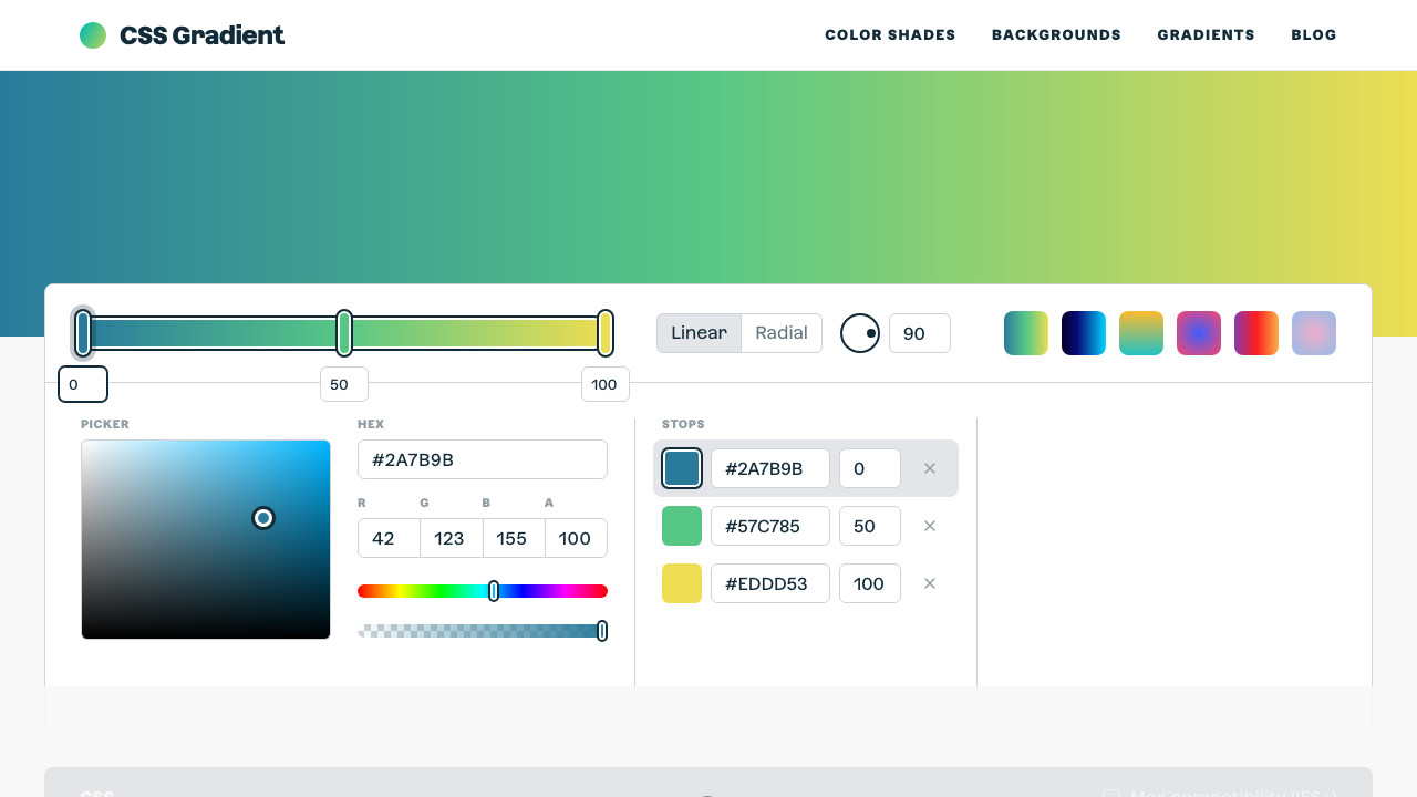
CSS Gradient
The ultimate CSS gradient generator with visual preview and code export.
#gradient#color#background
Build frosted-glass UI components visually. Adjust background opacity, backdrop blur, border transparency, border radius, and shadow intensity — with a vivid gradient preview so you can see the effect instantly.
Glassmorphism with live preview. Adjust the controls to see changes in real time.
Background color
Border color
Pick a background colour and opacity. Lower opacity (10–25%) gives the most realistic glass look.
Increase backdrop-filter blur (8–20px) to create the frosted glass effect.
A subtle white border at 15–30% opacity adds depth and realism to the glass card.
Hit Copy CSS to get the complete glass effect CSS including webkit prefix, ready to paste.
From our directory of 30+ CSS tools.
Know a great CSS tool?
Submit it to the directory and help developers discover it.