generators
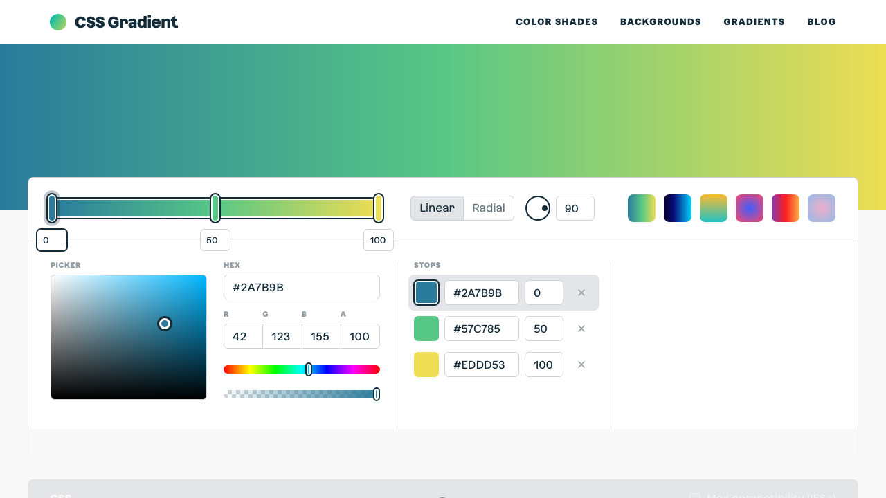
CSS Gradient
The ultimate CSS gradient generator with visual preview and code export.
#gradient#color#background
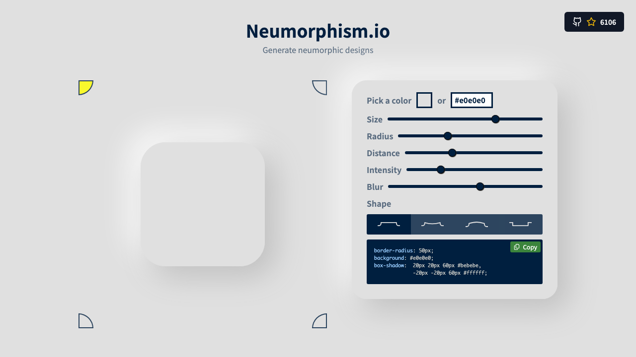
Design soft-UI neumorphic elements visually. Choose between Flat, Pressed, Concave, and Convex shapes. Tune distance, blur, and intensity while the background colour automatically derives the correct light and dark shadow colours.
Background color
Shape type
Preview shape
Derived shadow colors
Choose a mid-tone colour — greys like #e0e0e0 work best. Extremes (black/white) reduce the effect.
Flat and Pressed are most common. Concave/Convex add subtle gradients for extra depth.
Adjust distance and blur. Intensity controls how strong the light/dark shadow contrast is.
Hit Copy CSS to get the complete box-shadow and background declarations.
From our directory of 30+ CSS tools.
Know a great CSS tool?
Submit it to the directory and help developers discover it.