A plain --var can't be smoothly animated — the browser treats it as an opaque token, not a number, color, or angle. @property fixes that in a few lines of CSS, no JavaScript required.
Quick Answer
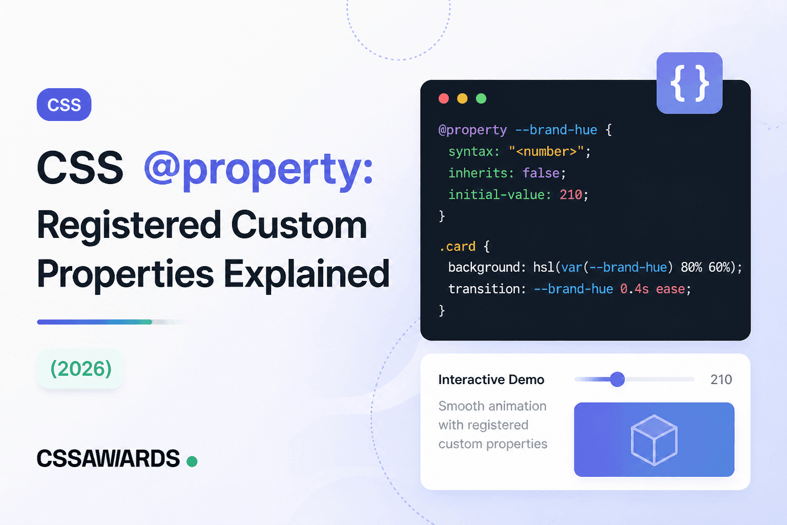
@property is a CSS at-rule that registers a custom property with a real type — an angle, a color, a number, a length — instead of letting it default to an untyped token stream. Once registered, the browser knows how to interpolate the property, which is what unlocks smooth transitions and animations on values stored in custom properties.
Custom properties (--like-this) have been usable in CSS for years, but by default they're essentially placeholders for raw text — the browser substitutes the value wherever var(--like-this) appears without understanding what kind of value it actually holds. That's fine for static values, but it breaks down the moment you try to animate one. @property, part of the CSS Properties and Values API, closes that gap by letting you formally declare a custom property's type up front.
Quick Answer
An unregistered custom property has the implicit syntax "*"— "any token sequence." The browser can't compute a midpoint between two arbitrary token sequences the way it can compute a midpoint between two numbers, so transitions and animations on it just snap instantly instead of interpolating.
Here's the exact failure most people run into: a conic-gradient() whose rotation angle is stored in a custom property, with a transitionon hover. It looks like it should animate. It doesn't.
/* This does NOT animate — --angle is an unregistered custom property, so the browser can't interpolate it */.dial { --angle: 0deg; background: conic-gradient(from var(--angle), #4338ca, #db2777); transition: --angle 1s ease;}.dial:hover { --angle: 360deg; /* jumps instantly, no smooth spin */}The gradient still updates on hover — it just jumps straight from 0deg to 360deg with no motion in between, because transitionhas nothing it knows how to interpolate. The value isn't “an angle” to the browser at this point; it's just characters.
Quick Answer
Every @property rule needs three descriptors: syntax (the accepted value type, e.g. '<angle>' or '<color>'), inherits (whether child elements inherit the value), and initial-value (the fallback used before any value is set) — the rule is invalid and ignored if any is missing, except initial-value when the syntax is the universal '*'.
@property --angle { syntax: '<angle>'; inherits: false; initial-value: 0deg;}Common syntax values you'll actually use: '<angle>' for rotations and gradient directions, '<color>' for theme colors, '<number>' for opacity or scale multipliers, '<length>' or '<percentage>' for sizes, and '<length> | <percentage>' when either is acceptable. Set inherits: false for one-off values scoped to a single component, and inherits: truefor theme-level tokens that should cascade down, matching how you'd treat a regular inherited CSS property.
With the correct syntax registered, applying the change is exactly the same as before — you still write --angle: 360deg and use var(--angle). Nothing about how you *use* the property changes; only how the browser *interprets* it does.
Now the same animation from the previous section, unchanged except for adding the @property rule above it:
.dial { --angle: 0deg; background: conic-gradient(from var(--angle), #4338ca, #db2777); transition: --angle 1s ease;}.dial:hover { --angle: 360deg; /* now spins smoothly through every value in between */}Quick Answer
Register an angle custom property, feed it into conic-gradient(from var(--angle), ...), and animate the property in a @keyframes rule — the gradient now rotates smoothly on every frame with pure CSS, replacing what previously required a JavaScript animation loop rewriting an inline style.
This is the single most common practical use of @property: continuously spinning conic-gradient loaders, animated gradient borders, and rotating hue effects — all things that, before @property, needed a requestAnimationFrame loop in JavaScript to update a style attribute 60 times a second.
@property --gradient-angle { syntax: '<angle>'; inherits: false; initial-value: 0deg;} .spinner { background: conic-gradient(from var(--gradient-angle), #7dd3fc, #0284c7, #7dd3fc); animation: spin 2s linear infinite;} @keyframes spin { to { --gradient-angle: 360deg; }}If you'd rather dial in a gradient visually before wiring up the animation, the CSS Gradient Generator covers linear, radial, and conic gradients with live draggable color stops and copyable CSS output.
Quick Answer
Registering a custom property with syntax: '<color>' lets you transition between two colors stored in that property — a smooth fade through the color ramp on hover or state change, instead of an instant hard cut.
This is especially useful for brand or theme colors referenced in multiple places, where you want a single hover/focus state change to animate consistently everywhere the variable is used, rather than hand-writing a separate transition: background-color on every element.
@property --brand-color { syntax: '<color>'; inherits: true; initial-value: #4338ca;} .button { background: var(--brand-color); transition: --brand-color 0.3s ease;}.button:hover { --brand-color: #db2777; /* fades through the colour ramp, not a hard cut */}| Behavior | Plain --var | @property --var |
|---|---|---|
| Can be transitioned/animated | ✗ Jumps instantly | ✓ Interpolates smoothly |
| Type-checked at parse time | ✗ Any token accepted | ✓ Invalid values rejected |
| Has a guaranteed fallback value | ✗ undefined until set | ✓ initial-value always applies |
| Inheritance is explicit | Always inherits | ✓ Configurable via inherits |
| Setup required | None — just use it | One @property block per property |
None of this means plain custom properties are obsolete — for static theme tokens (spacing scales, static color palettes, font stacks) that never need to animate, a plain --var is simpler and does the job. Reach for @propertyspecifically when a custom property's value needs to transition, animate, or be strictly type-checked.
Quick Answer
@property is Baseline widely available in 2026 — supported in Chrome/Edge since version 85 (2020), Safari since 16.4 (2023), and Firefox since version 128 (2024), the last of the major engines to ship it.
| Browser | Supported since |
|---|---|
| Chrome / Edge | Version 85 (2020) |
| Safari | Version 16.4 (2023) |
| Firefox | Version 128 (2024) |
The JavaScript equivalent, CSS.registerProperty(), has been available slightly longer and still works if you need to register a property conditionally at runtime — but for anything static and known ahead of time, the CSS-native @property at-rule is simpler, works with JavaScript disabled, and is the recommended approach going forward.
// The Houdini JS equivalent — same registration, no @property needed.
// Prefer @property in new code; this exists mainly in older codebases
// written before the at-rule shipped everywhere.
CSS.registerProperty({
  name: "--angle",
  syntax: "<angle>",
  inherits: false,
  initialValue: "0deg",
});Every syntax except the universal '*' requires initial-value. Skip it and the entire rule is dropped silently — no console warning, no error, the property just behaves as if @propertywas never written. If an animation you registered still isn't working, this is the first thing to check.
If you register syntax: '<angle>' and then set --angle: 10px somewhere, that declaration is invalid and gets ignored — it falls back to whatever the property's previous or initial value was. This is a feature, not a bug: it's exactly the type-safety @property is meant to add, but it can be confusing the first time a value silently fails to apply.
inherits: false only affects the CSS inheritance mechanism — a child element won't automatically pick up a parent's value if it isn't explicitly set on the child too. It doesn't restrict where var(--your-property) can be referenced; that still works anywhere the property has a value in scope.
Why can't you animate a regular CSS custom property?
Because it defaults to syntax '*' — an untyped token stream the browser can't interpolate between. Registering it with @property and a real syntax fixes this.
What does @property actually do?
It registers a custom property with a type (syntax), an inheritance rule (inherits), and a fallback (initial-value), so the browser knows how to interpolate it during transitions and animations.
Is @property the same as CSS.registerProperty()?
They achieve the same registration. @property is the CSS-native at-rule and is the recommended approach today; CSS.registerProperty() is the older JavaScript equivalent.
Is @property supported in all browsers in 2026?
Yes — Chrome/Edge since 2020, Safari since 2023, and Firefox since 2024. It's Baseline widely available with no fallback needed for a typical audience.
What happens if you skip initial-value in @property?
The whole rule becomes invalid and is ignored — silently, with no error — unless syntax is the universal '*'.
Can @property make CSS gradients animate smoothly?
Yes — registering an angle or color property and using it inside conic-gradient() or linear-gradient() is one of the most common uses, replacing JavaScript-driven gradient animation loops.
