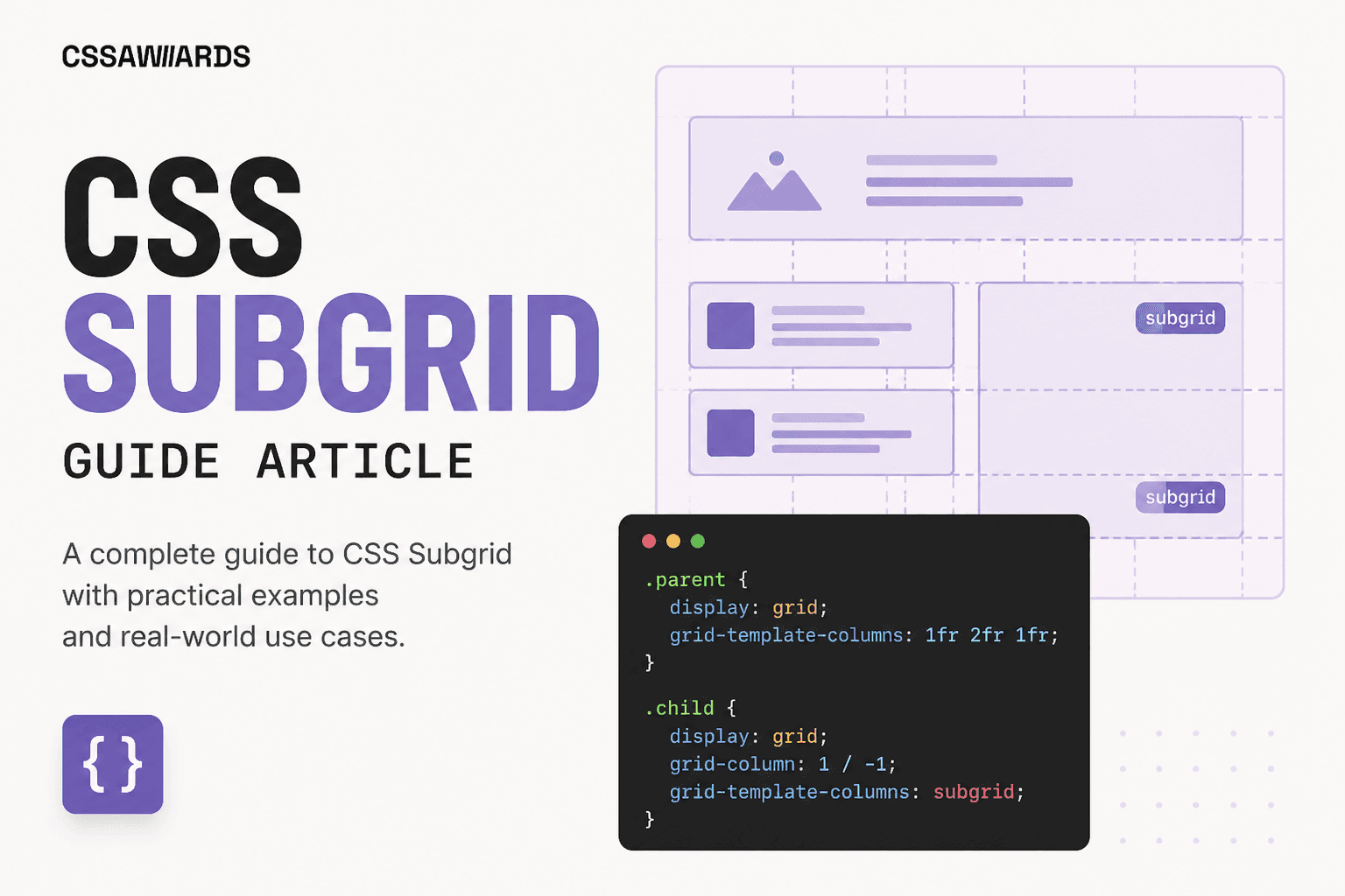
Nested grids don't align across siblings by default — each one sizes its own rows independently. subgridis the one-line fix, and it's finally supported everywhere.
Quick Answer
subgrid is a value for grid-template-columns or grid-template-rows that tells a nested grid item — which is itself a grid container — to reuse the exact track sizes of the parent grid it lives inside, instead of computing its own independent tracks.
CSS Grid has always allowed nesting — any grid item can itself be display: grid, creating a grid inside a grid. What it didn't offer, until subgrid, was a way for that inner grid to actually share sizing information with the outer one. Without it, every nested grid is an island: sized purely from its own content, with zero awareness of what its sibling items are doing.
Quick Answer
A row of cards, each internally laid out with its own display: grid, will misalign the moment any one card's content differs in length — a two-line title in one card doesn't push down the body/button rows of its neighbors, because each card's grid sizes its rows independently.
This is the single most common CSS Grid frustration that subgrid was built to solve. Picture a row of pricing or product cards, each with a title, a body of text, and a button pinned to the bottom. Internally, each card uses its own grid to stack those three pieces:
/* Each card is its own independent nested grid — row sizes are computed per-card, not shared */.card-grid { display: grid; grid-template-columns: repeat(4, 1fr); gap: 24px;} .card { display: grid; grid-template-rows: auto 1fr auto; /* title / body / button */ gap: 8px;}/* If one card's title wraps to 2 lines, only THAT card's title row grows — the body and button rows in every other card stay at their own independent height, so nothing lines up. */Visually, the result is a row of cards where the buttons land at different heights depending on how much text happened to be in each card's title and body — because “row 1” in card A and “row 1” in card B are two completely unrelated sizing calculations that just happen to be next to each other on screen.
Quick Answer
Set grid-template-rows: subgrid (or grid-template-columns: subgrid) on a grid item that is itself display: grid, and make sure it spans the parent tracks it should adopt via grid-row: span N or grid-column: span N.
Two things have to be true for subgrid to work: the element needs to be a grid item of an outer grid (so it has parent tracks to inherit), and it needs to itself be display: grid with subgridset on the axis you want shared. The item's span determines exactly how many parent tracks it adopts — a 3-row span pulls in 3 parent row tracks.
Quick Answer
Define the shared row tracks once on the parent (title / body / button), then have each card span and subgrid those same three row tracks — every card's title, body, and button now align across the whole row automatically, with no manual height matching.
Fixing the misaligned card example is a small, surgical change: define the row tracks on the parent instead of leaving them implicit, then tell each card to subgrid them.
.card-grid { display: grid; grid-template-columns: repeat(4, 1fr); grid-template-rows: auto 1fr auto; /* the tracks every card will share */ gap: 24px;} .card { display: grid; grid-row: span 3; /* must span the 3 parent row tracks */ grid-template-rows: subgrid; /* adopt the parent's row sizing */ gap: 8px;}/* Now every card's title/body/button rows are sized together — the tallest title in the row pushes every card's body/button down by the same amount. */The tallest title in the entire row now determines the height of the title track for every card, because all the cards are reading from the same shared set of row tracks rather than computing their own. This is the behavior that used to require JavaScript (measuring every card's title height and manually syncing it) or awkward fixed-height hacks — it's now one CSS property. To design the outer grid visually first, the CSS Grid Generatoris a fast way to prototype the parent's track structure before wiring up subgrid.
Quick Answer
If the parent grid's tracks have named lines, a subgrid inherits those names — so you can place items inside the subgrid using the same named lines defined on the parent, instead of counting track numbers.
This makes subgridded layouts considerably more readable, especially once there are more than two or three tracks to keep straight:
.card-grid { display: grid; grid-template-columns: repeat(4, 1fr); grid-template-rows: [title-start] auto [body-start] 1fr [button-start] auto [end]; gap: 24px;} .card { display: grid; grid-row: span 3; grid-template-rows: subgrid; /* line names are inherited too */} .card__title { grid-row: title-start; }.card__body { grid-row: body-start; }.card__button { grid-row: button-start; }| Behavior | Fresh nested grid | subgrid |
|---|---|---|
| Track sizes | Computed independently | ✓ Inherited from parent |
| Aligns with sibling items | ✗ Not automatically | ✓ Automatically |
| Named parent lines available | ✗ No | ✓ Yes, inherited |
| Fully independent internal layout | ✓ Yes | Constrained to parent tracks |
| Setup complexity | Lower | Slightly higher (span + subgrid) |
Neither is universally “better” — they solve different problems. A fresh nested grid is still the right call whenever a component's internal layout genuinely doesn't need to match its siblings. subgrid earns its slightly higher setup cost specifically when cross-sibling alignment is the actual requirement.
Quick Answer
Setting both grid-template-columns: subgrid and grid-template-rows: subgrid on the same nested grid item inherits parent tracks on both dimensions at once — useful for building fully aligned table-like layouts out of grid items instead of an actual <table>.
This pattern is common for data-table-style UI where each “row” is really a grid item spanning the full column count, and every row needs its columns to line up exactly with every other row's columns:
.data-grid { display: grid; grid-template-columns: 120px repeat(3, 1fr); grid-template-rows: repeat(4, auto); gap: 12px 24px;} .data-row { display: grid; grid-column: span 4; grid-row: span 1; grid-template-columns: subgrid; /* columns align across rows */}Quick Answer
subgrid is Baseline widely available in 2026 — Firefox supported it earliest (version 71, 2019), Safari added it in version 16 (2022), and Chrome/Edge shipped it in version 117 (2023).
| Browser | Supported since |
|---|---|
| Firefox | Version 71 (2019) |
| Safari | Version 16 (2022) |
| Chrome / Edge | Version 117 (2023) |
For an audience that might still include older browser versions, a safe fallback is to let the nested grid define its own reasonable independent tracks as the default, and treat perfectly synced alignment as a progressive enhancement — misaligned-but-usable beats a broken layout on the small remaining slice of unsupported browsers.
The one-line rule: if sibling grid items need their internal rows or columns to line up with each other, use subgrid. If each item's internal layout is self-contained, a plain nested grid is simpler.
The clearest signal you need subgridis noticing misalignment that only shows up when content length varies — cards whose buttons don't line up, form rows whose labels don't match column widths across sections, or table-like rows built from grid items that drift out of alignment. If your nested grids already look consistent because their content happens to be uniform, you likely don't need it yet — but it's worth reaching for proactively in any card-grid or form-grid component where content length is unpredictable.
What is subgrid in CSS Grid?
A value for grid-template-columns/rows that makes a nested grid reuse its parent's track sizes instead of computing its own independent ones.
Why don't nested CSS grids align by default?
Each nested grid computes its own track sizes from only its own content, with no awareness of sibling grids — so differing content lengths across siblings produce misaligned rows.
Is subgrid the same as a new nested grid?
No — a fresh nested grid still sizes its own tracks independently. subgrid inherits the parent's actual track sizes at the spanned lines, which is what enables automatic cross-sibling alignment.
Is CSS subgrid supported in all browsers in 2026?
Yes — Firefox since 2019, Safari since 2022, Chrome/Edge since 2023. It's Baseline widely available.
Can you use subgrid for both rows and columns at once?
Yes, by setting both grid-template-columns: subgrid and grid-template-rows: subgrid on the same item — useful for fully aligned table-like layouts.
When should I reach for subgrid instead of a plain nested grid?
When sibling items need their internal rows or columns to align with each other. If a nested grid's layout is self-contained, a plain independent grid is simpler and sufficient.
