
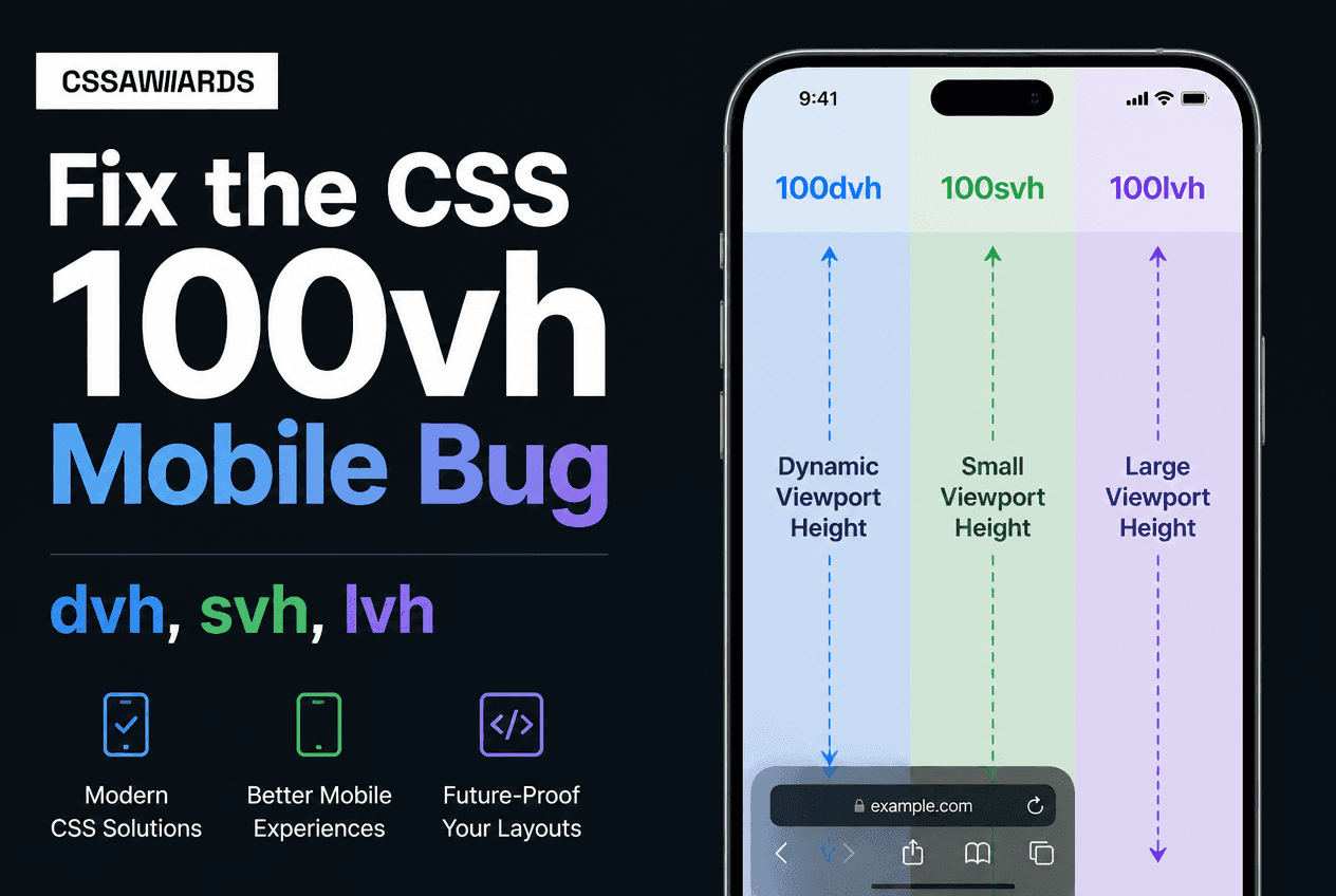
The 100vh Mobile Bug, Explained
Quick Answer
100vh is not working on mobile because it’s calculated against the largest possible viewport size — as if the browser’s address bar and toolbar were fully hidden — even when they’re currently visible and taking up screen space. This clips content at the bottom and causes jitter as the toolbar shows and hides while scrolling. Fix it by replacing 100vh with 100svh (never clipped) or 100dvh(tracks the live viewport) — both are native CSS, no JavaScript needed.
This is one of the most reported CSS bugs of the mobile-web era, and it still catches developers off guard: a section styled with height: 100vhlooks perfect in desktop devtools, then ships with the bottom few dozen pixels hidden behind the browser’s bottom toolbar on an actual iPhone. Or worse — the page visibly jumps and resizes every time the user scrolls, because the address bar is animating in and out and the layout is trying to keep up with a unit that was never designed to track it.
The good news: this is a solved problem. CSS shipped three new viewport-relative units specifically to fix it — svh, lvh, and dvh— and by 2026 they’re supported everywhere that matters. If you’re still reaching for the old JavaScript workaround, you can delete it.
Why It Happens: Mobile Browser UI and the Viewport
Mobile browsers dynamically show and hide their own UI chrome — the address bar at the top, and often a toolbar at the bottom — based on scroll direction, to give content more room. Safari on iOS is the most famous example, but many Android browsers do some version of the same thing.
The problem is that vh was specified long before this behavior existed, and browser vendors had to pick one viewport size to calculate it against. They chose the largest possible size — the viewport as it would be with the toolbar hidden — because recalculating every element’s size on every scroll frame used to be a real performance concern. That decision is exactly what causes the clipping: your 100vhelement is sized for a taller viewport than what’s actually visible the moment the toolbar is showing.
/* The bug: 100vh assumes the LARGEST possible viewport */.full-screen { height: 100vh; /* On mobile Safari and many mobile Chrome builds, this can be TALLER than what's actually visible on screen right now */} /* Result: the bottom of .full-screen is hidden behind the address bar and/or the bottom toolbar, and the layout jitters as the toolbar shows/hides on scroll */The jitter is a related but separate symptom: as the toolbar animates in and out, the actual visible area changes continuously, but 100vhstays fixed at the largest value the whole time — so anything positioned or sized relative to the viewport’s edge can appear to jump.
The Old Fix: The JavaScript --vh Hack
For roughly four years (2018 to 2022), the standard workaround was a small script that measured the real, current window height and stored it in a CSS custom property, updated on every resize and orientation change:
// The old fix — JavaScript "--vh" custom property hack
// (the standard workaround from roughly 2018–2022)

function setViewportHeight() {
  const vh = window.innerHeight * 0.01;
  document.documentElement.style.setProperty('--vh', `${vh}px`);
}

setViewportHeight();
window.addEventListener('resize', setViewportHeight);
window.addEventListener('orientationchange', setViewportHeight);
/* CSS reads the custom property instead of 100vh */.full-screen { height: calc(var(--vh) * 100);} /* Downsides: - requires a script to run before first paint, or you get a flash of the wrong size - needs resize + orientationchange listeners - one more moving part to keep in sync on every page that uses full-screen layout */This worked, but it came with real costs: a script had to run before first paint or you’d see a flash of incorrectly sized content, it needed event listeners kept alive for the life of the page, and it was one more piece of custom infrastructure every project had to carry — usually copy-pasted from a blog post, subtly different from project to project.
You almost certainly don’t need this hack anymore. If your project targets browsers from the last few years — which nearly all production sites do — the native dvh and svh units below replace it completely, with zero JavaScript.
The New CSS Units: svh, lvh, dvh at a Glance
Quick Answer
CSS defines three viewport-relative height units beyond plain vh: svh (small viewport height — static, smallest possible size, never clipped), lvh (large viewport height — static, largest possible size, close to old vh behavior), and dvh (dynamic viewport height — live, tracks the actual current viewport as browser UI shows and hides). Each has a matching width unit: svw, lvw, dvw.
/* Three new viewport-relative units — each has a static and a dynamic flavor */ .small { height: 100svh; } /* smallest possible viewport — UI fully visible */.large { height: 100lvh; } /* largest possible viewport — UI fully hidden */.dynamic { height: 100dvh; } /* live viewport — updates as UI shows/hides */ /* No JavaScript. No resize listeners. No --vh custom property. */These come from the CSS Values and Units Module and were designed specifically to solve the mobile viewport problem at the specification level, rather than leaving every team to reinvent the same JavaScript fix. The naming is consistent and easy to remember once it clicks: small is always the safest, most conservative size; large is always the most generous size; dynamic always matches what’s on screen right now.
Small Viewport Height (svh) — The Safe, Static Choice
/* svh — small viewport height *//* A STATIC value: the smallest the viewport will ever be, calculated as if browser UI is fully expanded/visible */ .hero { min-height: 100svh; /* Guaranteed: content is NEVER hidden behind the address bar or bottom toolbar, no matter what state the browser chrome is currently in */}svh is calculated as if the browser’s UI is at its most expanded — the smallest the visible area will ever be. Because it’s a static value, an element sized with 100svh never resizes as the user scrolls, and it’s mathematically guaranteed to fit within the visible screen no matter what state the toolbar is in. The trade-off is that once the toolbar hides itself, there will be a small strip of extra space below your svh-sized element that could technically have been used.
For most “does this content need to always be fully visible and never move” cases — hero sections, landing page above-the-fold content, splash screens — that trade-off is exactly the right one.
Large Viewport Height (lvh) — The Old 100vh Behavior, Made Explicit
/* lvh — large viewport height *//* A STATIC value: the largest the viewport will ever be, calculated as if browser UI is fully retracted/hidden */ .legacy-parity { height: 100lvh; /* Close to what 100vh used to silently assume — but now explicit and intentional, not accidental. Rarely the right default for mobile layouts. */}lvh is calculated as if the browser UI is fully retracted — the largest the visible area will ever be. This is close to what plain vh silently assumed all along, which is exactly why it caused the original bug: content was sized for a viewport state that often wasn’t the current one. lvh makes that same assumption available on purpose, when you actually want it, rather than by accident.
In practice, lvh is the least commonly reached-for of the three on mobile-first layouts — it’s mostly useful for parity testing against old vhbehavior, or for elements where you specifically want the maximum possible size and don’t mind a sliver being covered while the toolbar is showing.
Dynamic Viewport Height (dvh) — Tracks the Live Viewport
Quick Answer
dvh live-tracks the actual current viewport size as the browser toolbar shows and hides — no JavaScript, no resize listeners. Use it for app-like UI where content should reflow with the visible screen, such as a chat app’s message list and input bar. Because it changes in real time, elements sized with dvh will visibly resize during scroll, which is desirable for some layouts and distracting for others.
/* dvh — dynamic viewport height *//* A LIVE value: tracks the ACTUAL current viewport size in real time as the browser UI shows/hides on scroll */ .app-shell { height: 100dvh; /* Resizes live as the user scrolls — ideal for app-like UI where content should reflow with the currently visible screen area */}dvh is the closest native equivalent to what the old --vhJavaScript hack was trying to achieve — a height value that always matches what’s truly visible — except it’s computed by the browser’s own layout engine instead of a script, updates instantly with no event-listener lag, and never risks a flash of incorrect size before JavaScript runs.
The one thing to watch for: because dvh genuinely changes as the user scrolls, using it on an element that shouldn’t visually move (like a hero banner) can look like unwanted jank. That’s the signal to reach for svh instead.
Which One Should You Use? Decision Table
Quick Answer
Use svh for content that must never be clipped and shouldn’t resize while scrolling (hero sections, marketing pages). Use dvh for app-shell UI that should reflow with the live visible screen (chat apps, mobile web-app layouts). Reach for lvh only when you specifically need the old maximal-size behavior. Avoid plain 100vh for any full-screen mobile element going forward.
| Use case | Recommended unit | Why |
|---|---|---|
| Hero section / landing page | 100svh | Never clipped, never resizes mid-scroll |
| Splash / loading screen | 100svh | Content must always be fully visible |
| Chat app / messaging UI | 100dvh | Should reflow live with visible screen |
| Full-screen mobile app shell | 100dvh | Matches native app-like resizing behavior |
| Testing old-vh parity | 100lvh | Explicit maximal-viewport sizing |
| Any new full-screen mobile layout | Not 100vh | Ambiguous, causes the clipping/jitter bug |
If you need to reason about exact pixel equivalents for a specific device width — for example, converting a design spec’s vh value to px at a given viewport — the CSS Units Converter handles the math instantly across px, rem, vh, vw, and more.
Real Example: A Hero Section That’s Never Cut Off
Here’s a complete, production-ready hero section pattern. It uses 100vh as a fallback for very old browsers, then 100svhas the real value for anything modern — guaranteeing the heading and call-to-action are always fully visible, regardless of toolbar state:
/* A hero section that is never cut off on mobile */.hero { display: flex; flex-direction: column; align-items: center; justify-content: center; text-align: center; padding: 2rem; height: 100vh; /* fallback for older browsers */ min-height: 100svh; /* never clipped by mobile browser UI */} .hero h1 { font-size: clamp(2rem, 6vw, 4rem); margin: 0 0 1rem;}Notice this uses min-height rather than a fixed height — a good default for hero sections, since it lets the content grow taller than the viewport if needed (long headings, larger text on small devices) instead of clipping or overflowing. When you’re also tuning the layout across breakpoints, the CSS Media Query Builder is a fast way to preview how the section holds up at different viewport widths before shipping. For the general Grid-vs-Flexbox question that comes up when building sections like this, see the Grid vs Flexbox decision guide.
The Width Equivalents: svw, lvw, dvw
/* Width equivalents exist too, though needed far less often since horizontal browser UI is uncommon */ .full-width { width: 100vw; /* old unit — can trigger a horizontal scrollbar on some mobile browsers */ width: 100dvw; /* dynamic viewport width */} /* Logical, writing-mode-aware equivalents also exist */.block-size { block-size: 100dvb; } /* dynamic viewport block size */.inline-size { inline-size: 100dvi; } /* dynamic viewport inline size *//* Rarely needed outside vertical writing-mode contexts */Every height unit discussed above has a matching width unit, following identical logic: svw, lvw, and dvw. They’re needed far less often in practice, because horizontal browser UI that eats into the viewport width is uncommon — most of the toolbar behavior mobile browsers exhibit affects vertical space. Logical, writing-mode-aware equivalents (dvi, dvb, and their small/large variants) also exist for the rare case where a layout needs to respect a non-horizontal writing mode.
Browser Support & the Safe Fallback Pattern
Quick Answer
svh, lvh, and dvh are supported in Safari 15.4+, Chrome/Edge 108+, and Firefox 101+ — effectively universal by 2026. Write the old vh value first and the new unit second on the following line as a safe, one-line fallback; no @supports block is required.
| Browser | Min version | Release date |
|---|---|---|
| Safari | 15.4+ | March 2022 |
| Chrome / Edge | 108+ | November 2022 |
| Firefox | 101+ | May 2022 |
| Global (2026) | ~97% | Production-ready with a one-line fallback |
Notably, Safari — the browser most associated with the original clipping bug — was actually the first major engine to ship the fix. That means the exact browser most likely to trigger the problem is also guaranteed to support the solution.
/* The safe fallback pattern — old unit first, new unit second */ .full-screen { height: 100vh; /* used by browsers that don't know dvh */ height: 100dvh; /* used by all modern browsers — overrides the line above where supported */} /* This isn't a media query or @supports block — it relies on a browser simply ignoring a declaration it doesn't recognize and keeping the last VALID value it does */This fallback pattern needs no feature query because it relies on ordinary CSS error handling: a browser that doesn’t recognize 100dvh as a valid value simply discards that declaration and keeps the previous valid one. There’s no flash, no layout shift, and no JavaScript involved — just two lines of CSS. For a broader look at how modern viewport-relative and responsive units fit together, see the CSS Media Queries guide.
Frequently Asked Questions
Why is 100vh not working on mobile?
100vh is calculated against the largest possible viewport size — as if the browser’s toolbar were hidden — even when it’s currently visible. This clips content and causes jitter as the toolbar shows and hides during scroll. Use 100svh or 100dvh instead.
What is the difference between svh, lvh, and dvh in CSS?
svh is a static value equal to the smallest the viewport ever gets (never clipped). lvh is a static value equal to the largest the viewport ever gets (close to old vh behavior). dvh live-updates to match the current actual viewport as the toolbar shows or hides.
Should I use dvh or svh for a full-screen hero section?
Use svh for hero sections — it guarantees the content is never clipped and won’t resize while the user scrolls. Use dvh for app-like UI that should track the live visible viewport, such as a chat interface.
Do I still need the JavaScript --vh custom property hack?
No. That hack was the standard fix from roughly 2018-2022. svh, lvh, and dvh solve the same problem natively in CSS, with no JavaScript, no resize listeners, and no flash of incorrect size before a script runs.
What browsers support svh, lvh, and dvh?
Safari 15.4+, Chrome/Edge 108+, and Firefox 101+. Support is effectively universal by 2026 (roughly 97%+ global), so these units are safe for production with a one-line vh fallback.
Why does my page jump or jitter when scrolling on mobile Safari?
This happens when an element is sized with 100vh, or positioned with position: fixed against the viewport edges, while the toolbar animates in and out during scroll. Switching to 100dvh, or restructuring fixed elements into a flex layout, eliminates the jitter.
What is the safe fallback pattern for dvh and svh?
Declare the property twice: height: 100vh; followed on the next line by height: 100dvh;. Browsers that don’t recognize the new unit ignore that line and keep the 100vh value; browsers that do recognize it apply the override. No @supports block needed.
Is there a dvw for width, like dvh for height?
Yes. svw, lvw, and dvw are the width equivalents, following the same small/large/dynamic logic. They’re needed less often since horizontal browser UI is uncommon, but they behave consistently with the height units.