This is the fast version: a one-sentence rule, a 30-second checklist, and 6 common layout patterns mapped straight to the right tool — for when you need an answer in the next 10 seconds, not a full reference. For the exhaustive breakdown of every Grid and Flexbox property, see our complete Grid vs Flexbox developer guide.
TL;DR
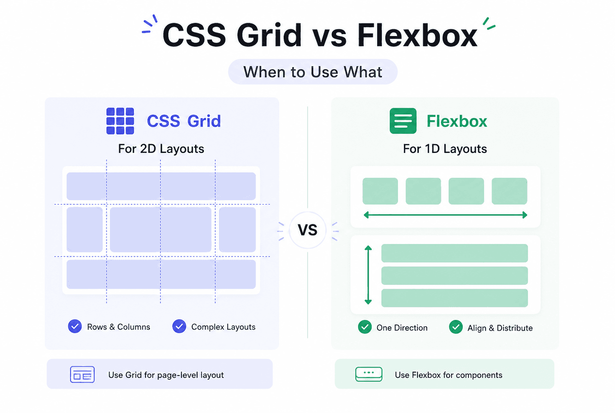
One direction (a row or a column) → Flexbox. Two directions at once (rows and columns together) → Grid. Most real layouts use both: Grid for the page-level skeleton, Flexbox for the one-dimensional content inside each Grid area.
Quick Answer
If you are arranging items along one axis — a row or a column — use Flexbox. If you need to control both rows and columns simultaneously, use CSS Grid. That single distinction resolves the vast majority of real layout decisions.
/* ONE DIRECTION → Flexbox */.nav { display: flex; justify-content: space-between; align-items: center; gap: 16px;} /* TWO DIRECTIONS → Grid */.page-layout { display: grid; grid-template-columns: 240px 1fr; grid-template-rows: auto 1fr auto; gap: 24px;}Both layout systems were designed for genuinely different problems, not as competing solutions to the same one. Flexbox was built to distribute and align items in a single dimension — think of it as a smart, flexible version of inline-block or float. Grid was built to define a two-dimensional layout skeleton up front, then place items into named areas within it. Reaching for the wrong one does not usually break anything, but it does mean fighting the system for something it was not designed to do.
☐ Do you only need to control ONE row or ONE column? → Flexbox
☐ Do items need to wrap and reflow based on available space? → Flexbox (with flex-wrap) or Grid (with auto-fill/auto-fit)
☐ Do you need items to align across BOTH rows and columns at once? → Grid
☐ Are you laying out a whole page (header/nav/main/aside/footer)? → Grid
☐ Does content size dictate layout (e.g. a nav bar that shrinks to fit its links)? → Flexbox
☐ Does the layout need explicit overlap or precise placement by grid line number? → Grid
When two answers point in different directions for the same component — which happens constantly — that is usually a sign the component needs both: Grid for its outer structure, Flexbox for the content inside one of its cells. See the Using Both Together section below.
| Dimension | Flexbox | Grid |
|---|---|---|
| Axis control | One dimension (row OR column) | Two dimensions (rows AND columns) |
| Layout direction | Content-driven — items size themselves | Container-driven — you define tracks upfront |
| Best unit | flex-grow / flex-shrink / flex-basis | fr unit, minmax(), repeat() |
| Named regions | Not supported | grid-template-areas |
| Overlap items | Difficult, needs position: absolute | Native — items can share grid cells |
| Browser support | All major browsers since 2017 | All major browsers since 2017 |
| Typical use | Nav bars, button groups, card content | Page layout, card galleries, image grids |
Flexbox
Grid
| Pattern | Use | Why |
|---|---|---|
| Navigation bar | Flexbox | One row, evenly spaced, content-sized items |
| Card gallery / image grid | Grid | auto-fill + minmax() builds a responsive grid with zero media queries |
| Full page layout (header/nav/main/aside/footer) | Grid | Named grid-template-areas describe the whole skeleton in one place |
| Button group / toolbar | Flexbox | One row, gap-separated, no need for two-dimensional control |
| Form with labels and inputs | Grid | Aligns labels and inputs into consistent columns across every row |
| Vertically centered content | Flexbox | align-items: center on a single axis is the simplest centering method |
/* Nav bar — one-dimensional, evenly spaced */.nav { display: flex; justify-content: space-between; align-items: center;}.nav-links { display: flex; gap: 24px;}/* Responsive card grid — no media queries required */.card-gallery { display: grid; grid-template-columns: repeat(auto-fill, minmax(240px, 1fr)); gap: 20px;}/* Columns automatically wrap based on available width *//* Holy Grail layout — Grid for the page skeleton */.page { display: grid; grid-template-columns: 200px 1fr 200px; grid-template-rows: auto 1fr auto; grid-template-areas: "header header header" "nav main aside" "footer footer footer"; min-height: 100vh;}.header { grid-area: header; }.nav { grid-area: nav; }.main { grid-area: main; }.aside { grid-area: aside; }.footer { grid-area: footer; }The “Holy Grail” layout above is the canonical example of why Grid exists: five named regions, arranged in two dimensions, defined in a single readable declaration. Doing this with Flexbox alone requires nested flex containers and manual width calculations that grid-template-areas eliminates entirely. One thing to watch on mobile: min-height: 100vh on the page container can get clipped or jitter behind a mobile browser’s toolbar — see the 100vh mobile bug guide for the dvh/svh fix.
Quick Answer
Yes, and it is the standard professional pattern: use Grid for the page-level or component-level skeleton, and nest Flexbox inside individual Grid areas for the one-dimensional content within them.
/* Grid for the page skeleton, Flexbox inside each area — the standard professional pattern */.page { display: grid; grid-template-columns: 240px 1fr; gap: 24px;} /* Flexbox INSIDE a grid area — for the one-dimensional content within it */.card { display: flex; flex-direction: column; gap: 12px;}.card-footer { display: flex; justify-content: space-between; align-items: center;}This is not a compromise or a workaround — it is how Grid and Flexbox were designed to be used together from the start. A typical card component uses Grid (or auto-fill) to lay out the gallery of cards, then Flexbox inside each card to stack its title, body, and footer, and Flexbox again inside the footer to space out a price and a button. Reaching for “Grid vs Flexbox” as an either/or choice for an entire page is usually the wrong framing.
Flexbox is best for
Grid is best for
The fastest way to internalize this decision is to build both kinds of layout and see the difference. The Flexbox Playground lets you configure flex-direction, wrap, justify-content, align-items, and per-item flex-grow/shrink/basis with a live preview. The CSS Grid Generator does the same for column/row counts, track sizes, gaps, and includes 4 ready-made presets (Holy Grail, Blog, Magazine, Cards).
“Grid vs Flexbox” is rarely an either/or decision at the scale of a real project — it is a per-component decision made dozens of times across a single page, and most pages end up using both. The one-sentence rule (one axis vs two) resolves the decision instantly for 90% of components; the 10% that seem ambiguous are almost always asking for Grid on the outside and Flexbox on the inside.
For the complete property-by-property reference — every Grid and Flexbox value, alignment property, and edge case — see the full CSS Grid vs Flexbox: The Complete Developer Guide.
Share this article
