
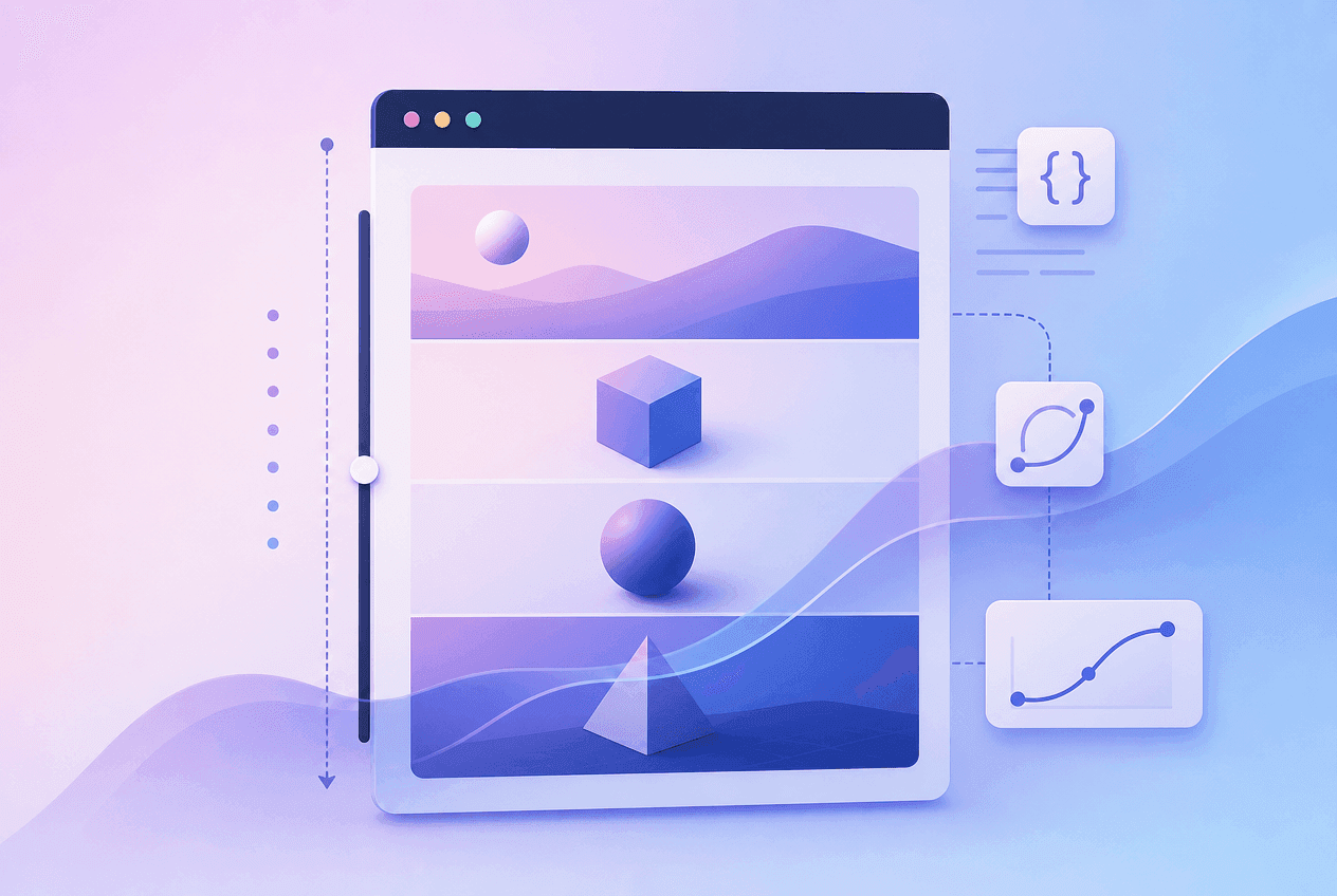
What Are CSS Scroll-Driven Animations?
Quick Answer
CSS scroll-driven animations are animations whose playhead is controlled by scroll position rather than elapsed time. Set animation-timeline: scroll() to link an animation to a scroll container’s progress, or animation-timeline: view()to link it to an element’s position within the visible area. No JavaScript required — the browser handles the connection between scroll and animation on the compositor thread.
Standard CSS animations play on a time axis: you define a duration in seconds and the animation runs from start to finish in that time. Scroll-driven animations replace the time axis with a scroll position axis. Instead of asking “how many seconds have passed?”, the browser asks “how far has the user scrolled?” — and uses that fraction to determine where in the animation to render.
This single change unlocks a category of effects that previously required JavaScript: scroll progress indicators, parallax depth, sticky headers that animate as you scroll past them, and elements that fade or slide in as they enter the viewport. Because the animation runs on the compositor thread (for transform and opacity), it is inherently smoother than JavaScript scroll handlers — no requestAnimationFrame loop, no getBoundingClientRect() on every scroll tick.
The CSS scroll-driven animations spec introduces two new timeline functions (scroll() and view()), a new property (animation-range), and support for named timelines (scroll-timeline and view-timeline). Chrome 115 shipped the initial implementation in July 2023, and the spec has since reached stable support across all major browsers.
animation-timeline: scroll() — Scroll Progress Animations
Quick Answer
animation-timeline: scroll() links an element’s animation to the scroll progress of its nearest scrollable ancestor. At 0% scroll the animation is at its from keyframe; at 100% scroll it is at its to keyframe. Do not set animation-duration — scroll position replaces time as the driver.
The scroll() function accepts two optional arguments: scroller and axis.
/* scroll() function syntax */animation-timeline: scroll(); /* Nearest scrollable ancestor, both axes */ animation-timeline: scroll(root); /* The root scrollport (the page itself) */ animation-timeline: scroll(nearest block); /* Nearest ancestor, block (vertical) axis */ animation-timeline: scroll(self inline); /* The element itself, inline (horizontal) axis */ /* Axis values: block | inline | x | y *//* Scroller values: nearest | root | self */The scroller argument specifies which scroll container to track: nearest (default — the nearest scrollable ancestor), root (the document root / page scroll), or self (the element itself if it is scrollable). The axis argument specifies which axis to track: block (default — vertical in horizontal writing mode), inline (horizontal), y, or x.
When you set animation-timeline to a scroll() value, any animation-duration you set is ignored — the scroll position entirely controls where in the animation the browser renders. This is why you omit animation-duration (or you can set it to auto) in scroll-driven animations.
Important: The animation-fill-mode: both property is essential for scroll-driven animations. Without it, the animation snaps back to its initial state when the user scrolls back to the top. both means the animation holds its from state at 0% scroll and its to state at 100% scroll.
animation-timeline: view() — Element Visibility Animations
Quick Answer
animation-timeline: view() links an element’s animation to its own visibility within the scroll container. The animation progresses from 0% (element just begins entering the viewport) to 100% (element has fully exited). Combine with animation-range: entry 0% entry 40% to run the animation only while the element is entering — perfect for reveal effects.
While scroll() tracks the entire scroll container, view()tracks an individual element’s position relative to the visible area. This is the tool for element-specific scroll effects.
/* view() function syntax */animation-timeline: view(); /* Tracks this element's visibility in the nearest scroller */ animation-timeline: view(block); /* Block axis only (most common — vertical scroll) */ animation-timeline: view(inline 20px); /* Inline axis with 20px inset on both sides */ /* The inset parameter shrinks the visible area: view(block 100px) means the "visible" range starts 100px before the element enters and ends 100px after it exits — useful for triggering reveals slightly before elements reach the viewport edge */The view timeline is divided into phases based on the element’s relationship to the scroll container’s visible region:
| Phase | When it occurs | animation-range keyword |
|---|---|---|
| entry | Element scrolls into the visible area | entry 0% entry 100% |
| exit | Element scrolls out of the visible area | exit 0% exit 100% |
| cover | Element overlaps the visible area (entry + contain + exit) | cover 0% cover 100% |
| contain | Element is fully inside the visible area | contain 0% contain 100% |
For reveal effects, you almost always want the entry range — run the animation while the element enters the viewport, and leave it in its final state after it is fully visible.
animation-range — Start and End Points
Quick Answer
animation-range: entry 0% entry 30%tells the browser to run the animation only during the first 30% of the element’s entry phase. This prevents the animation from playing across the entire scroll range and instead completes quickly as the element appears — the natural behaviour users expect from reveal animations.
/* animation-range controls which part of the timeline the animation maps to */ /* Reveal on enter — runs as element enters viewport */.reveal { animation: fade-in linear both; animation-timeline: view(); animation-range: entry 0% entry 30%; /* Animation runs from when element starts entering to when it is 30% inside the viewport */} /* Exit fade — runs as element leaves */.fade-out { animation: fade-out linear both; animation-timeline: view(); animation-range: exit 0% exit 100%;} /* Cover range — full time element overlaps viewport */.sticky-progress { animation: progress linear both; animation-timeline: view(); animation-range: cover 0% cover 100%;}animation-range is a shorthand for animation-range-start and animation-range-end. The value consists of a timeline phase keyword (entry, exit, cover, contain, entry-crossing, exit-crossing) followed by a percentage within that phase.
For scroll-progress animations (using scroll()), you typically leave animation-range at its default (normal, covering the full 0%–100% scroll range). For element-reveal animations (using view()), you typically constrain the range to the entry phase to avoid the animation reversing as the user scrolls further.
Named Scroll & View Timelines
The scroll() and view() functions attach a timeline to the nearest ancestor by default. For more precise control — referencing a specific scroll container or observing a specific element from a sibling — you use named timelines.
/* Named scroll timelines — for animations that reference a specific scroll container by name */ /* 1. Declare the named timeline on the scroller */.scroll-container { overflow-y: scroll; scroll-timeline-name: --card-scroll; scroll-timeline-axis: block;} /* Shorthand */.scroll-container { scroll-timeline: --card-scroll block;} /* 2. Reference it from a child or sibling element */.progress-indicator { animation: grow-width linear both; animation-timeline: --card-scroll;} /* This allows you to track a custom scroll container (a modal, a sidebar) rather than the root page */Named view timelines let you observe one element and drive an animation on a completely different element — enabling effects like a sidebar indicator that highlights as a section header scrolls into view:
/* Named view timelines — attach a view timeline to a specific element and reference it from another */ /* 1. Register the view timeline on the observed element */.section-header { view-timeline-name: --section-header; view-timeline-axis: block; /* Shorthand */ view-timeline: --section-header block;} /* 2. Drive an animation on a different element using that view timeline */.sidebar-indicator { animation: highlight-active linear both; animation-timeline: --section-header; animation-range: entry 30% exit 0%;}Named timelines unlock cross-element choreography: one element’s visibility drives another element’s animation. This is powerful for building reading-progress sidebars, active-section highlighting in navigation, and any effect where the observed element and the animated element are not the same DOM node.
Build a Reading Progress Bar
A scroll progress indicator is the “hello world” of scroll-driven animations. Here is the complete implementation — a fixed bar at the top of the page that fills from left to right as the user scrolls:
/* ── Reading progress bar — pure CSS, zero JavaScript ── */ /* The bar element */.progress-bar { position: fixed; top: 0; left: 0; width: 100%; height: 4px; background: #1D9E75; transform-origin: left center; z-index: 9999;} /* @keyframes: from invisible to full-width */@keyframes grow-width { from { transform: scaleX(0); } to { transform: scaleX(1); }} /* Link the animation to the page scroll */@media (prefers-reduced-motion: no-preference) { .progress-bar { animation: grow-width linear both; animation-timeline: scroll(root block); /* No duration — scroll position drives progress */ }}The key insight is transform-origin: left center combined with a scaleX(0 → 1) animation. This scales the element horizontally from its left edge — creating the fill-from-left behaviour. The @keyframes here are just two lines, but if you want to prototype variations (colour shifts, opacity pulses, multi-step fills), the CSS Keyframes Builder lets you author and preview @keyframes visually before copying the output. Using transform: scaleX() instead of animating width is critical for performance: it runs on the compositor thread and avoids layout recalculation on every scroll event.
The HTML is minimal — just a single <div> at the top of the <body>:
<div class="progress-bar" aria-hidden="true"></div>Add aria-hidden="true"since the bar is decorative — screen readers don’t need to announce it.
Build a Parallax Scroll Effect
Parallax — where background elements move at a different speed than the foreground — creates a sense of depth. Here is the pure CSS implementation using animation-timeline: view():
/* ── Parallax scroll effect ── */ /* The image scrolls at half the speed of the page */@keyframes parallax-shift { from { transform: translateY(-20%); } to { transform: translateY(20%); }} @media (prefers-reduced-motion: no-preference) { .parallax-image { animation: parallax-shift linear both; animation-timeline: view(); animation-range: cover 0% cover 100%; /* The image moves 40% total (from -20% to +20%) across the entire time the section overlaps the viewport — creating a parallax depth effect */ }} /* Wrap the image in an overflow: hidden container to clip the excess movement */.parallax-wrapper { overflow: hidden; height: 500px;}The cover range runs the animation across the entire time the section is visible — from when its top edge reaches the bottom of the viewport to when its bottom edge leaves the top. During this range, the image translates from -20% to +20%— a total of 40% movement against the section’s 100% scroll distance. This ratio (40% image movement : 100% section movement = 0.4) creates the parallax depth perception.
Accessibility: Parallax motion is a known trigger for vestibular disorders. Always wrap parallax animations in @media (prefers-reduced-motion: no-preference). When reduced motion is preferred, either show a static image or reduce the translation to a near-zero value.
Sticky section header progress
A common variation uses a named view timeline to show how far through a section the user has scrolled — useful for long-form articles or step-by-step tutorials:
/* ── Sticky section header with scroll progress ── */ /* Progress bar inside a sticky section header */.section { /* This section is our scroll container reference */ view-timeline: --section block;} .section__progress { position: sticky; top: 0; height: 3px; background: #1D9E75; transform-origin: left; animation: grow-width linear both; animation-timeline: --section; animation-range: cover 0% cover 100%; /* Fills up as the section scrolls through the viewport */}Build Reveal-on-Scroll Without Intersection Observer
The most widely used scroll animation pattern is revealing content as it enters the viewport. JavaScript developers typically handle this with Intersection Observer and a class toggle. CSS scroll-driven animations make this a two-property addition to any element:
/* ── Reveal on scroll: fade in + slide up ── */ @keyframes reveal-up { from { opacity: 0; transform: translateY(32px); } to { opacity: 1; transform: translateY(0); }} @media (prefers-reduced-motion: no-preference) { .reveal-on-scroll { animation: reveal-up 0.6s ease both; animation-timeline: view(); animation-range: entry 0% entry 35%; }} /* No JavaScript. No Intersection Observer. Add class="reveal-on-scroll" to any element. */Add class="reveal-on-scroll" to any element in your HTML and it will fade in and slide up as it scrolls into view. The animation-range: entry 0% entry 35% ensures the animation completes quickly (within the first 35% of the entry phase) rather than dragging on as the user keeps scrolling. The both fill mode holds the element at opacity: 0 until it starts entering, then holds it at opacity: 1 after completing.
Staggering multiple elements
To stagger multiple child elements, use animation-delay with a negative value referencing the percentage offset into the view timeline:
/* Stagger card reveals using animation-delay */.cards-grid .card { animation: reveal-up linear both; animation-timeline: view(); animation-range: entry 0% entry 35%;} .card:nth-child(1) { animation-delay: calc(0 * -1%); }.card:nth-child(2) { animation-delay: calc(5 * -1%); }.card:nth-child(3) { animation-delay: calc(10 * -1%); }/* Each card starts 5% later in the entry phase */Note that negative animation-delay with scroll-driven timelines shifts the start point of the animation earlier into the timeline — effectively staggering when each card’s animation begins relative to the scroll position. The easing curve of each reveal matters too — a well-tuned ease-out makes entries feel natural, while linear motion feels robotic. The Cubic Bezier Builder lets you dial in the exact curve and copy the cubic-bezier() value directly into your animation.
Scroll-driven animations also complement CSS transitions for hover states that appear after an element has revealed. If you need to build the transition shorthand for those states, the CSS Transition Generator produces copy-paste output with duration, easing, and delay controls.
Performance & will-change Best Practices
CSS scroll-driven animations that animate transform and opacityrun on the compositor thread — the same thread that handles scrolling. This means they don’t block the main JavaScript thread and don’t cause layout recalculation, giving you genuinely smooth 60fps+ animations even on mid-range mobile devices.
| Property | Compositor thread? | Notes |
|---|---|---|
transform | ✓ Yes | Preferred for all movement and scale |
opacity | ✓ Yes | Preferred for fade effects |
filter | Partial | May promote to its own layer |
width / height | ✗ No | Triggers layout — use scaleX/scaleY instead |
background-color | ✗ No | Triggers paint — use opacity overlay instead |
margin / padding | ✗ No | Triggers layout — use translate instead |
When to use will-change
will-change: transform hints to the browser that an element will be animated, prompting it to promote the element to its own compositor layer in advance. For scroll-driven animations, this is generally not needed — the browser handles layer promotion automatically when the animation begins. Overusing will-change consumes GPU memory unnecessarily. Only add it for elements where you observe jank in DevTools performance recordings.
/* Only if you observe jank in DevTools — not by default */.parallax-image { will-change: transform; /* add only if measurably needed */}Accessibility & prefers-reduced-motion
Scroll-driven animations can cause discomfort or nausea for users with vestibular disorders, particularly parallax and large-scale movement effects. The prefers-reduced-motion media query lets you opt out or reduce these effects for users who have indicated a preference for less motion in their operating system settings.
/* Always respect prefers-reduced-motion */ /* Approach 1: Wrap animations */@media (prefers-reduced-motion: no-preference) { .reveal-card { animation: fade-in-up linear both; animation-timeline: view(); animation-range: entry 0% entry 40%; }} /* Approach 2: Reset in reduced-motion query */.reveal-card { animation: fade-in-up linear both; animation-timeline: view(); animation-range: entry 0% entry 40%;} @media (prefers-reduced-motion: reduce) { .reveal-card { animation: none; opacity: 1; transform: none; }}The recommended pattern is to define animations within a @media (prefers-reduced-motion: no-preference) block rather than overriding them in a separate reduce block. This ensures no animation runs at all by default until the user has explicitly indicated they accept motion — a stricter but more accessible approach. The second approach (reset in the reduce query) is acceptable when you want most users to see the animation and only accommodate those who have opted out.
For scroll progress bars and non-movement scroll effects (like changing a header’s background colour as the page scrolls), reduced motion is less critical — the effect is informational rather than decorative. Still, always consider whether a user who has requested less motion would benefit from seeing the effect.
Browser Support
| Browser | Min version | Notes |
|---|---|---|
| Chrome / Edge | 115+ | Full support since July 2023 |
| Firefox | 132+ | Stable, unflagged since Oct 2024 |
| Safari | 18+ | Full support since Sep 2024 |
| Global (mid-2026) | ~84% | Production-ready with @supports fallback |
/* Progressive enhancement with @supports */@supports (animation-timeline: scroll()) { .progress-bar { animation: grow-width linear both; animation-timeline: scroll(root block); }} /* Without @supports, .progress-bar is simply hidden or shows as a static element — no broken layout */For reveal-on-scroll specifically, the graceful degradation is perfect: in unsupported browsers, elements remain at their final opacity: 1state (since the animation never starts), so content is always readable. The animation is purely progressive enhancement — users on older browsers simply don’t see the reveal effect, but they see all the content.
Frequently Asked Questions
What are CSS scroll-driven animations?
CSS scroll-driven animations are animations whose progress is tied to a scroll position rather than elapsed time. Using animation-timeline: scroll() or view(), the browser advances or reverses an animation based on how far a scroll container has scrolled or where an element sits relative to the visible area.
What is animation-timeline in CSS?
animation-timeline is a CSS property that specifies what drives an animation’s progress. The default is auto (time-based). Set it to scroll() to link progress to a scroll container’s scroll position, or view() to link it to an element’s visibility within its scroll container.
What is the difference between scroll() and view() in CSS?
scroll() tracks how far a scroll container has been scrolled — 0% at the top, 100% at the bottom. Used for global scroll progress indicators. view() tracks when a specific element enters and exits the scroll container’s visible area. Used for per-element reveal, parallax, and exit effects.
How do I make a scroll progress bar with CSS only?
Set position: fixed, transform-origin: left center on the bar element. Define @keyframes from scaleX(0) to scaleX(1). Apply animation: grow-width linear both; animation-timeline: scroll(root block); — no duration needed. Wrap in @media (prefers-reduced-motion: no-preference).
What is animation-range in CSS?
animation-range limits the portion of the scroll or view timeline an animation covers. For example, animation-range: entry 0% entry 30% runs the animation only during the first 30% of an element entering the viewport. Available phase keywords: entry, exit, cover, contain.
Can CSS scroll-driven animations replace Intersection Observer?
For reveal-on-scroll visual effects (fade in, slide up, scale in), yes — animation-timeline: view() is a complete CSS-only replacement. For logic-based side effects (data fetching, class toggling, lazy loading) triggered by scroll position, Intersection Observer is still required.
What browsers support CSS scroll-driven animations in 2026?
Chrome 115+, Edge 115+, Firefox 132+, and Safari 18+. Global browser support is approximately 84% as of mid-2026. Use @supports (animation-timeline: scroll()) for progressive enhancement.
Do CSS scroll-driven animations affect performance?
Animations of transform and opacity run on the compositor thread, making them as smooth as the scroll itself. Avoid animating properties that trigger layout (width, height, margin) — use scaleX/scaleY and translate instead. Do not add will-change preemptively; the browser promotes layers automatically.