
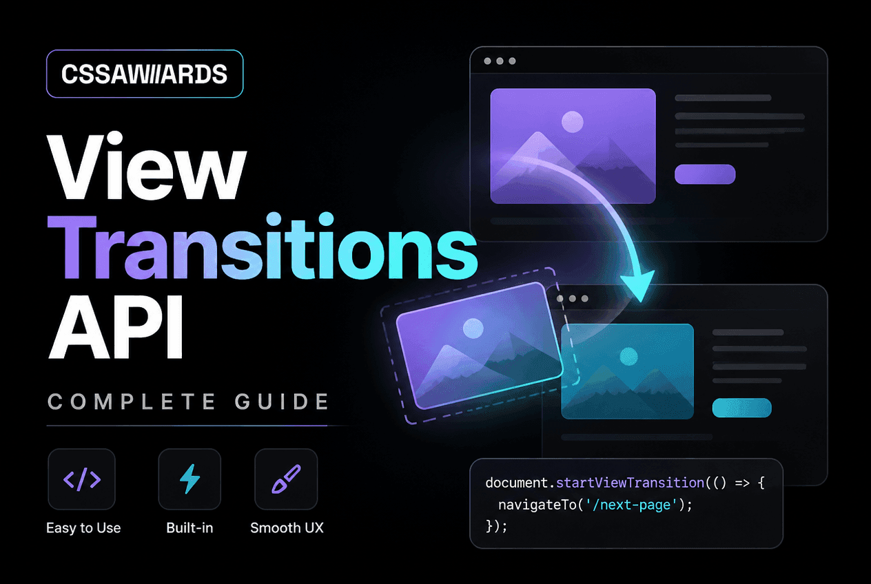
What Is the View Transitions API?
Quick Answer
The View Transitions API lets you animate between two DOM states with one call: document.startViewTransition(callback). The browser snapshots the page before the callback runs, applies your DOM update, snapshots the page again, and cross-fades between the snapshots — no manual position measuring, no third-party animation library required.
Before this API existed, animating “from one page state to another” — a card expanding into a detail view, a route change fading in, a full page navigation sliding like a native app — required either the FLIP technique (First, Last, Invert, Play: measure positions before and after, then animate the difference) implemented by hand, or a third-party library like Barba.js or Swup wrapping that same manual work.
The View Transitions API moves this capability into the browser engine itself. Instead of your JavaScript measuring bounding boxes and computing transforms, the browser takes an actual rasterised snapshot of the old and new states and animates between them using CSS you can fully customize. This is both simpler to use and more visually correct — the browser is compositing real pixels, not approximating a transform.
There are two flavours: same-document transitions for single-page app (SPA) route changes, driven entirely by JavaScript, and cross-document transitions for traditional multi-page (MPA) navigations, driven entirely by CSS. This guide covers both in full, plus the parts most tutorials skip — view-transition-class, transition types for direction-aware animation, and production-safe fallbacks.
Same-Document vs Cross-Document Transitions
Quick Answer
Same-document transitions animate a DOM change within one page load — used for SPA route changes — and are triggered from JavaScript with document.startViewTransition(). Cross-document transitions animate a full page navigation between two separate page loads — used for traditional MPAs — and are enabled purely with CSS via @view-transition { navigation: auto; }.
/* ── Same-document (SPA) transition ── *//* Runs entirely in JS, for client-side route changes */document.startViewTransition(() => { router.navigateTo('/products/42'); // e.g. React/Vue/vanilla router}); /* ── Cross-document (MPA) transition ── *//* No JavaScript needed — just CSS on BOTH pages */@view-transition { navigation: auto;}/* Add this rule to the outgoing page's CSS AND the incoming page's CSS. A normal <a href="/next-page"> click now triggers a full browser-native cross-fade between the two full page loads. */This distinction matters a lot for framework choice. If you are building a server-rendered, multi-page site — a blog, a marketing site, a content-heavy CSSAWWWARDS-style directory — cross-document transitions give you app-like page transitions with zero JavaScript and zero client-side router. If you are building an SPA with React Router, Vue Router, or a custom client-side router, same-document transitions slot directly into your existing navigation logic.
The two are not mutually exclusive — a hybrid site can use cross-document transitions for full page loads and same-document transitions for any SPA-like partial updates (a filter panel, a modal, a tab switch) within a single page.
Your First Transition: startViewTransition()
/* The simplest possible view transition */if (!document.startViewTransition) { // No support — just update the DOM directly updateTheDOM();} else { document.startViewTransition(() => updateTheDOM());} function updateTheDOM() { document.querySelector('#content').innerHTML = newContentHTML;} /* That's it. The browser: 1. Takes a snapshot of #content (and everything else) as it looks NOW 2. Runs your callback, which changes the DOM 3. Takes a snapshot of the NEW state 4. Cross-fades between the two snapshots automatically */startViewTransition() returns a ViewTransition object with several useful promises: ready resolves once the pseudo-element tree is set up and animations are about to start, updateCallbackDone resolves once your callback has finished running, and finished resolves once the entire transition animation has completed. In most cases you only need finished — for example, to know when it is safe to focus a newly rendered element.
If your DOM update is asynchronous (say, it awaits a fetch before rendering), return that promise from the callback — the browser will wait for it before capturing the “after” snapshot, so the transition never fires against a half-updated page.
How the Browser Captures Snapshots (the Pseudo-Element Tree)
Every view transition — same-document or cross-document — generates a tree of pseudo-elements you can target directly in CSS. Understanding this tree is the key to customizing anything beyond the default cross-fade:
/* The pseudo-element tree the browser generates for every transitioning element (default name: "root") */ ::view-transition /* overlay covering the viewport */└─ ::view-transition-group(root) /* animates position/size */ └─ ::view-transition-image-pair(root) /* holds both snapshots */ ├─ ::view-transition-old(root) /* snapshot BEFORE the change */ └─ ::view-transition-new(root) /* snapshot AFTER the change */ /* Every element with a view-transition-name gets this exact same 4-level tree, generated under its own name instead of "root" — that's what makes each named element animate independently. */By default, the entire page is treated as a single transitioning element named root. The browser automatically generates a default cross-fade animation on ::view-transition-old(root) (fading out) and ::view-transition-new(root) (fading in) — which is why a bare startViewTransition() call already produces a visible, correct crossfade with no CSS at all.
Naming Elements With view-transition-name
Quick Answer
Give an element view-transition-name: my-namein CSS to pull it out of the default whole-page transition and animate it independently. If an element with the same name exists on both the “before” and “after” state — even at a different position or size — the browser smoothly animates between the two, producing a shared-element (or “hero”) transition.
/* ── Shared-element transition: thumbnail → hero image ── */ /* On the LIST page, the thumbnail gets a name tied to its id */.thumbnail[data-id="42"] { view-transition-name: product-image-42;} /* On the DETAIL page, the hero image gets the SAME name */.hero-image { view-transition-name: product-image-42;} /* Because both elements share one view-transition-name, the browser animates smoothly between their two positions/sizes — the "shared element" or "hero" effect popularized by native apps and Flutter, now native to CSS. */ document.startViewTransition(() => { renderProductDetailPage(42);});Each named element gets its own independent pseudo-element tree (the same 4-level structure from the previous section, generated under that name instead of root), layered above the root transition. This is what makes the classic “thumbnail grows into a full-size image” effect possible — the browser interpolates position, size, and border-radius between the two states automatically, with no manual FLIP math.
Constraint: a view-transition-name must be unique among elements visible at the same time during a single transition. Two elements with the same name active simultaneously will throw and abort the transition — this matters for lists, covered next.
view-transition-name: auto & view-transition-class for Lists
Hand-writing a unique view-transition-name for every row in a dynamic list is impractical. view-transition-name: auto solves the naming problem by having the browser generate a unique name per element automatically:
/* ── Naming every item in a list without hand-writing names ── */ .grid-item { view-transition-name: auto; /* browser generates a unique name per element */} /* Give every generated pseudo-element a SHARED class so you can style them all with one rule, instead of one rule per auto-generated name */.grid-item { view-transition-name: auto; view-transition-class: grid-item-transition;} /* Style every element carrying that class at once */::view-transition-group(.grid-item-transition) { animation-duration: 0.4s; animation-timing-function: cubic-bezier(0.4, 0, 0.2, 1);} /* Without view-transition-class you would need a separate ::view-transition-group(name) rule for every single auto-generated name, which is impossible to predict ahead of time. The class makes bulk styling of dynamic lists practical. */The second half of that snippet — view-transition-class — is easy to miss in most write-ups but essential for real usage. Since auto names are unpredictable, you cannot target them individually with ::view-transition-group(name). view-transition-class assigns a shared class to every pseudo-element generated from elements carrying it, so one CSS rule styles the whole list uniformly regardless of how many auto-generated names exist underneath.
Styling Transitions: ::view-transition-old/-new/-group
The default cross-fade is rarely the final design. Override any part of the pseudo-element tree with ordinary CSS animations:
/* ── Overriding the default cross-fade ── */ /* Slow the whole-page (root) transition down */::view-transition-old(root),::view-transition-new(root) { animation-duration: 0.5s;} /* Give a specific named element a custom entrance animation instead of the default cross-fade */@keyframes scale-in { from { transform: scale(0.85); opacity: 0; } to { transform: scale(1); opacity: 1; }} ::view-transition-new(product-image-42) { animation: scale-in 0.4s cubic-bezier(0.2, 0, 0, 1) both;} /* Turn OFF the outgoing snapshot's fade so only the new element fades in (no cross-fade "ghosting") */::view-transition-old(product-image-42) { animation: none;} /* Style the group (position/size) separately from the image-pair (the actual pixels) for full control */::view-transition-group(product-image-42) { animation-duration: 0.5s;}| Pseudo-element | What it controls |
|---|---|
::view-transition-group(name) | Position & size (the animated “box” morphing between old/new geometry) |
::view-transition-image-pair(name) | Container for the old/new snapshots — rarely styled directly |
::view-transition-old(name) | The “before” snapshot — usually fading/animating out |
::view-transition-new(name) | The “after” snapshot — usually fading/animating in |
Every pseudo-element here is a real, animatable box — you can apply any CSS animation property, including custom @keyframes, animation-timing-function, and multi-step animations. To design the easing curve itself, the Cubic Bezier Builder is a fast way to dial in a custom timing function before pasting it into animation-timing-function.
Cross-Document (MPA) Transitions
Quick Answer
Add @view-transition { navigation: auto; } to the CSS of both the outgoing and incoming page. Ordinary <a href> navigations between same-origin pages then get an automatic cross-fade transition — shipped in Chrome 126, with no JavaScript router required.
/* Add this to the CSS of EVERY page that should participate in cross-document transitions — outgoing AND incoming */@view-transition { navigation: auto;} /* Optional: name specific elements the same way you would for a same-document transition — this works across full page loads too, as long as the element exists (with the same view-transition-name) on both pages */.site-logo { view-transition-name: site-logo;} .article-hero-image { view-transition-name: article-hero;} /* No JavaScript router required. A plain <a href="/blog/next-post">Next post</a> click now triggers the full-page cross-fade automatically in supporting browsers, and a normal instant navigation everywhere else. */This is arguably the more significant half of the API for the majority of the web, which is still server-rendered multi-page sites rather than SPAs. A blog, documentation site, or content directory can add app-like page transitions with three lines of CSS and no client-side routing layer at all — something that was previously impossible without turning the site into an SPA or reaching for a heavyweight library like Turbo/Hotwire with its own page-swap machinery.
Named elements work across cross-document transitions exactly as they do in the same-document case — as long as an element with a matching view-transition-name exists on both the page being left and the page being entered, it transitions as a shared element (see Naming Elements above), even though the two elements live in entirely separate documents.
Transition Types: Forward vs Back Navigation
A common request is “forward navigation should slide left, back navigation should slide right,” matching native mobile app conventions. The types option makes this possible without maintaining separate transition logic:
/* ── Different animations for forward vs back navigation ── */ // JS: tag the transition with a "type"function navigate(direction) { document.startViewTransition({ update: () => renderNewRoute(), types: [direction], // 'forward' or 'back' });} backButton.addEventListener('click', () => navigate('back'));nextButton.addEventListener('click', () => navigate('forward'));/* CSS: match the active type with :active-view-transition-type() */ :root:active-view-transition-type(forward) { &::view-transition-old(root) { animation-name: slide-out-left; } &::view-transition-new(root) { animation-name: slide-in-right; }} :root:active-view-transition-type(back) { &::view-transition-old(root) { animation-name: slide-out-right; } &::view-transition-new(root) { animation-name: slide-in-left; }} @keyframes slide-out-left { to { transform: translateX(-30%); opacity: 0; } }@keyframes slide-in-right { from { transform: translateX(30%); opacity: 0; } }@keyframes slide-out-right { to { transform: translateX(30%); opacity: 0; } }@keyframes slide-in-left { from { transform: translateX(-30%); opacity: 0; } } /* Now "forward" navigation slides left, "back" navigation slides right — the native mobile-app pattern, in pure CSS. */:active-view-transition-type(name) matches only while a transition carrying that type is actively running, and only on the document root — this is what lets one stylesheet define direction-aware animations that activate conditionally, instead of toggling classes in JavaScript before every navigation.
Common Patterns: Gallery Zoom & SPA Fade
Two complete, production-shaped patterns you can adapt directly.
Pattern 1 — Gallery grid to full-size lightbox
/* ── Full pattern: gallery grid → full-size lightbox ── */ /* CSS — shared on both the grid and the lightbox markup */.gallery-thumb { view-transition-name: auto; view-transition-class: gallery-photo;} .lightbox-image { view-transition-name: var(--photo-name); /* set inline per photo */} ::view-transition-group(.gallery-photo) { animation-duration: 0.35s; animation-timing-function: cubic-bezier(0.2, 0, 0, 1);} /* JS */function openLightbox(photoId, imgEl) { const name = `photo-${photoId}`; imgEl.style.setProperty('view-transition-name', name); const openIt = () => { document.querySelector('.lightbox-image').style.setProperty('view-transition-name', name); renderLightbox(photoId); }; if (!document.startViewTransition) { openIt(); return; } document.startViewTransition(openIt);}Pattern 2 — Simple SPA route fade
/* ── Full pattern: simple SPA route fade ── */ /* CSS */::view-transition-old(root) { animation: 180ms ease-out both fade-out;}::view-transition-new(root) { animation: 220ms ease-in both fade-in;}@keyframes fade-out { to { opacity: 0; } }@keyframes fade-in { from { opacity: 0; } } /* JS — wrap your router's navigation call */async function navigateTo(path) { if (!document.startViewTransition) { await renderRoute(path); return; } const transition = document.startViewTransition(() => renderRoute(path)); await transition.finished; // resolves when the animation completes}Notice both patterns feature-detect before calling startViewTransition — this is not optional defensive code, it is required, since calling an undefined method throws. The CSS View Transitions Generator lets you preview fade, slide, and scale variants of these exact patterns live and copy the generated CSS and JS directly, which is a faster way to explore timing and easing than editing keyframes by hand. If you only need a one-off entrance fade rather than a full before/after transition, the plain-CSS Fade-In & Entrance Animations snippet is a lighter option with no API involved.
Respecting prefers-reduced-motion
Page and element transitions are exactly the kind of large, screen-filling motion that prefers-reduced-motion: reduce exists to suppress for users with vestibular disorders or motion sensitivity. Handle it at either layer:
/* ── Respecting prefers-reduced-motion ── */ /* Option A: neutralise the animations, keep using the API (still swaps the DOM correctly, just without motion) */@media (prefers-reduced-motion: reduce) { ::view-transition-group(*), ::view-transition-old(*), ::view-transition-new(*) { animation: none !important; }} /* Option B: skip the API entirely in JS */const prefersReducedMotion = window.matchMedia( '(prefers-reduced-motion: reduce)').matches; function go(update) { if (prefersReducedMotion || !document.startViewTransition) { update(); return; } document.startViewTransition(update);}Option A keeps using the View Transitions API (so the DOM swap still benefits from the browser’s snapshot-based correctness) while removing visible motion. Option B skips the API path entirely. Either is valid; Option A is slightly preferable because it keeps a single code path rather than branching your update logic.
Feature Detection & Safe Fallbacks
document.startViewTransition is undefined in unsupported browsers — calling it directly throws a TypeError. Never call it unconditionally. Wrap it once in a small helper and reuse that helper everywhere in your app:
/* ── Safe, production-ready wrapper ── */ function withViewTransition(update) { const supported = 'startViewTransition' in document && !window.matchMedia('(prefers-reduced-motion: reduce)').matches; if (!supported) { update(); return Promise.resolve(); } const transition = document.startViewTransition(update); return transition.finished;} /* Usage stays identical either way — callers never need to branch on support themselves */withViewTransition(() => renderNextPage());This wrapper combines feature detection and the prefers-reduced-motion check from the previous section into one function, so every call site in your codebase gets both protections automatically and consistently, rather than relying on each call site to remember to check.
Browser Support & Comparison to JS Libraries
Quick Answer
Same-document view transitions work in Chrome/Edge 111+ and Safari 18+. Cross-document transitions work in Chrome/Edge 126+. Firefox has not shipped either without a flag as of early 2026 — always confirm current status on caniuse.com and treat the API as a progressive enhancement with a feature-detected fallback, never a hard requirement.
| Browser | Same-document | Cross-document |
|---|---|---|
| Chrome / Edge | 111+ (March 2023) | 126+ (mid-2024) |
| Safari | 18+ (2024) | Not yet shipped |
| Firefox | Not shipped without a flag | Not shipped without a flag |
Support figures for this API move quickly — verify the current state on caniuse.com before shipping, rather than trusting any single article’s snapshot, including this one.
What this replaces
| JavaScript approach | What it required | View Transitions API |
|---|---|---|
| Manual FLIP technique | Measure bounding boxes before/after, compute transform deltas | Browser measures and animates automatically |
| Barba.js / Swup (MPA transition libraries) | Intercept links, fetch HTML, swap DOM, animate manually | @view-transition { navigation: auto; }, zero JS |
React 19 experimental <ViewTransition>, Astro transitions | Framework-specific wrapper components | Both are built on top of this same native browser API |
For browsers without support, your feature-detected fallback (see Feature Detection above) simply updates the DOM instantly with no animation — a completely acceptable degradation, not a broken experience. This makes the View Transitions API one of the rare browser features that is both a pure progressive enhancement and dramatically simpler than any polyfill or library it replaces. Prototype your own timing and variants first with the CSS View Transitions Generator before wiring the generated code into your router.
Frequently Asked Questions
What is the View Transitions API?
A browser API that animates between two DOM states with a single call to document.startViewTransition(). The browser captures a snapshot before and after your DOM update and cross-fades between them, using CSS you can fully customize.
How do I start a view transition in JavaScript?
Call document.startViewTransition(callback), where callback performs the DOM update. Example: document.startViewTransition(() => { content.innerHTML = newHTML; }). The browser handles the snapshotting and animation.
What is view-transition-name used for?
It assigns a unique identifier to an element so it animates independently instead of being folded into the default whole-page transition — the mechanism behind shared-element (“hero”) transitions like a thumbnail growing into a full-size image.
Does the View Transitions API work across full page navigations, not just SPAs?
Yes. Cross-document transitions, shipped in Chrome 126, let a traditional multi-page site get transitions on full page loads. Add @view-transition { navigation: auto; } to the CSS of both the outgoing and incoming page — no JavaScript router required.
Which browsers support the View Transitions API?
Same-document transitions: Chrome/Edge 111+, Safari 18+. Cross-document transitions: Chrome/Edge 126+. Firefox has not shipped either without a flag as of early 2026 — check caniuse.com for the current state and always ship with a feature-detected fallback.
How do I give forward and back navigation different transition animations?
Pass a types array to startViewTransition({ update, types: ['forward'] }), then match it in CSS with :active-view-transition-type(forward) to apply direction-specific @keyframes.
How do I disable view transitions for users who prefer reduced motion?
Set animation: none on the pseudo-elements inside an @media (prefers-reduced-motion: reduce) block, or skip calling startViewTransition entirely and update the DOM directly when that media query matches.
Do I still need a JavaScript animation library for page transitions?
For supporting browsers, no — the API replaces most of what libraries like Barba.js or Swup did manually. You still need a feature-detected fallback for unsupported browsers, but no third-party dependency is required for the transition itself.