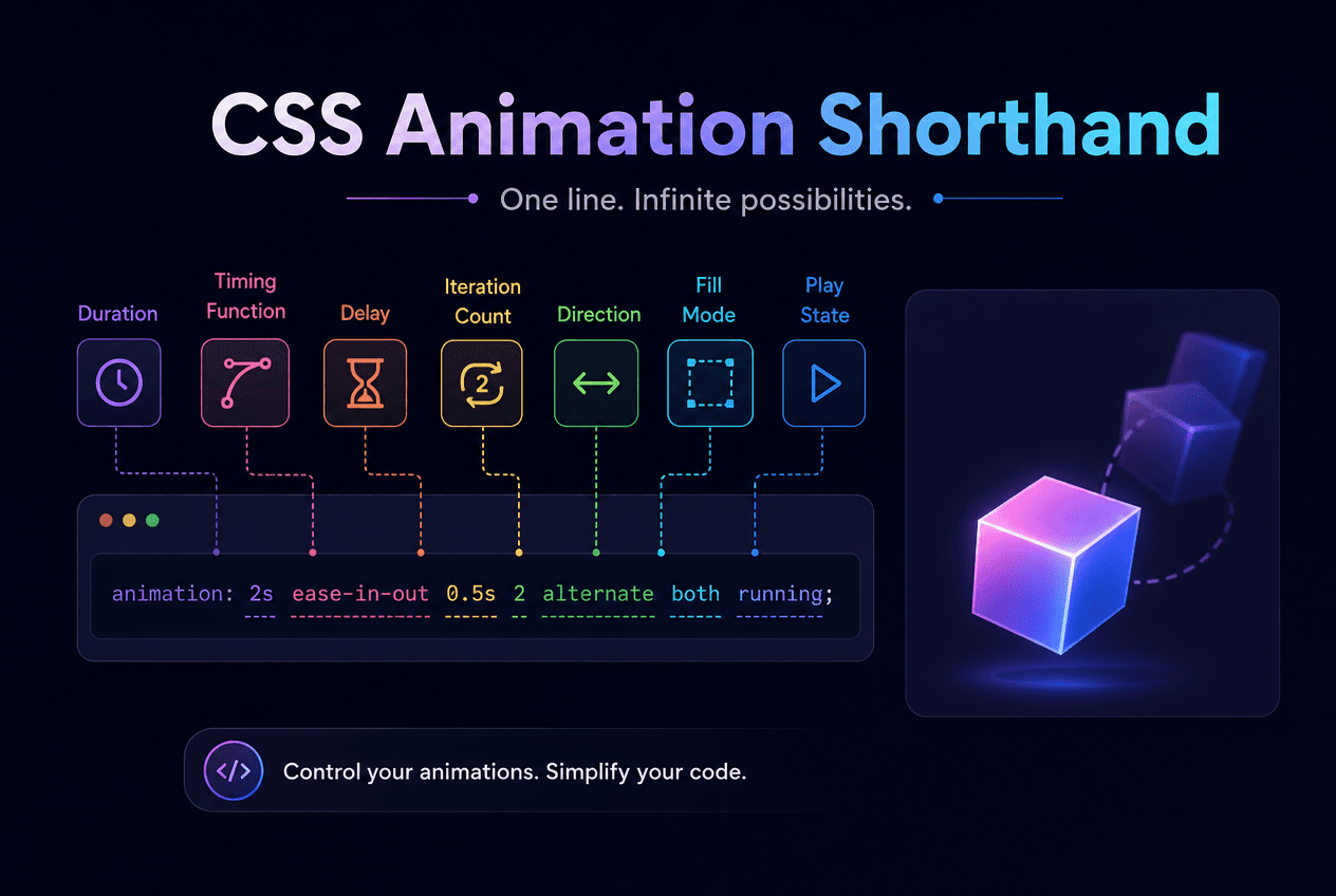
The animation shorthand packs eight sub-properties into a single line — and it is also one of the most commonly misused declarations in CSS, mostly because two of those eight values look identical and are told apart only by position. This guide breaks down the correct order, the duration/delay trap that catches almost everyone at least once, fill-mode, looping and direction, and exactly when shorthand beats longhand (and vice versa). A free visual generator with 12 presets is included so you never have to memorize the order again.
TL;DR
animation: name duration timing-function delay iteration-count direction fill-mode play-state — only name and duration are required. The two positional time values are the trap: the first is always duration, the second is always delay, no matter which one you meant. fill-mode: both is the safest default for entrance/exit animations since it prevents both the pre-delay flash and the post-animation snap-back.
Quick Answer
The animation shorthand sets all eight animation sub-properties in one declaration: animation: name duration timing-function delay iteration-count direction fill-mode play-state. Only name (a @keyframes identifier) and durationare required — every other value falls back to its default if omitted.
Writing eight properties by hand every time you want an animation is tedious, so CSS provides animation as a single-line shorthand that accepts all eight values in one declaration, separated by spaces. The browser matches each value to its property by type — a keyword like ease-out is recognized as a timing function regardless of position, but the two time-based values (duration and delay) are ambiguous by type and are instead resolved by position.
/* Longhand — 8 individual properties */.element { animation-name: fade-in; animation-duration: 600ms; animation-timing-function: ease-out; animation-delay: 0ms; animation-iteration-count: 1; animation-direction: normal; animation-fill-mode: both; animation-play-state: running;} /* Shorthand — same result, one line */.element { animation: fade-in 600ms ease-out 0ms 1 normal both;} @keyframes fade-in { from { opacity: 0; } to { opacity: 1; }}Multiple animations can run on the same element by separating full shorthand declarations with commas: animation: slide-in 0.4s ease-out forwards, fade-in 0.3s ease-out forwards. Each runs independently and both apply simultaneously — useful for combining a positional entrance with a separate opacity fade without writing one combined @keyframes rule.
Quick Answer
The eight sub-properties are animation-name, animation-duration, animation-timing-function, animation-delay, animation-iteration-count, animation-direction, animation-fill-mode, and animation-play-state. Only name and duration are required to see any effect.
| Property | Values | Default |
|---|---|---|
animation-name | @keyframes name, or none | none |
animation-duration | time in s or ms | 0s |
animation-timing-function | ease, linear, cubic-bezier() | ease |
animation-delay | time in s or ms | 0s |
animation-iteration-count | number or infinite | 1 |
animation-direction | normal, reverse, alternate, alternate-reverse | normal |
animation-fill-mode | none, forwards, backwards, both | none |
animation-play-state | running, paused | running |
Most of these values are self-identifying keywords, so the browser can parse them in almost any order within the shorthand — ease-out is unambiguously a timing function, infinite is unambiguously an iteration count. The one exception, covered next, is the pair of time values for duration and delay.
Quick Answer
When two time values appear in the shorthand, the first is always duration and the second is always delay— regardless of which one you intended. This is the most common source of “my animation is playing at the wrong speed” bugs.
/* The spec rule: the FIRST time value is always duration, the SECOND time value (if present) is always delay */.a { animation: bounce 0.6s 0.2s; } /* 0.6s duration, 0.2s delay */.b { animation: bounce 0.2s 0.6s; } /* 0.2s duration, 0.6s delay — often a mistake! */ /* Safest approach when the order isn't obvious at a glance: */.c { animation-name: bounce; animation-duration: 0.6s; animation-delay: 0.2s;}Common Mistake
Writing animation: fade-in 0.2s 0.6swhen you meant “wait 0.2s, then animate over 0.6s” actually produces the opposite: a 0.2s animation that waits 0.6s to start. If your animation feels instant or oddly slow, check this first before debugging anything else.
This ambiguity is exactly why the longhand properties (animation-duration and animation-delay) exist and are worth reaching for whenever the shorthand’s order is not immediately obvious to whoever reads the code next — including future you. There is no performance cost to being explicit; it is purely a readability tradeoff.
Quick Answer
fill-mode controls what happens to an element’s styles outside the active animation period. forwards keeps the last keyframe’s styles after it ends. backwards applies the first keyframe’s styles during any delay. both does both, and is the safest default for entrance/exit animations.
/* none (default) — snaps back to original styles when done */.snap-back { animation: fade-in 0.4s ease-out;} /* forwards — keeps the LAST keyframe's styles after finishing */.stays-visible { animation: fade-in 0.4s ease-out forwards;} /* backwards — applies the FIRST keyframe's styles during the delay */.no-flash { animation: fade-in 0.4s ease-out 0.5s backwards; /* without backwards, the element flashes at full opacity during the 0.5s delay */} /* both — combines forwards and backwards */.safest-default { animation: pop-in 0.4s cubic-bezier(0.34,1.56,0.64,1) 0.2s both;}The default value, none, means the element snaps back to its pre-animation styles the instant the animation finishes — almost never the intended behavior for an entrance animation. Forgetting forwards is the second most common animation shorthand mistake after the duration/delay trap: without it, an element that fades and slides into view will finish the animation, then instantly revert to invisible and offset.
backwards matters specifically when there is a delay: without it, an element with animation-delay: 0.5s is fully visible in its un-animated state for that half-second before the animation begins — a visible flash that backwardseliminates by pre-applying the first keyframe’s styles for the duration of the delay.
Quick Answer
iteration-count sets how many times the animation plays — a number or infinite. direction sets whether it plays forwards (normal), backwards (reverse), or alternates on each pass (alternate) for a seamless ping-pong loop.
/* Iteration count */.once { animation-iteration-count: 1; } /* default */.thrice { animation-iteration-count: 3; }.forever { animation-iteration-count: infinite; } /* Direction */.normal { animation-direction: normal; }.reverse { animation-direction: reverse; }.ping-pong { animation-direction: alternate; } /* smooth back-and-forth */.ping-pong2 { animation-direction: alternate-reverse; } /* Infinite ping-pong pulse — the most common "attention" pattern */@keyframes pulse { from { transform: scale(1); opacity: 1; } to { transform: scale(1.08); opacity: 0.85;}}.pulse { animation: pulse 1.2s ease-in-out infinite alternate;}Without alternate, a looping animation jumps abruptly from its final state back to its starting state on every repeat — a visible snap that rarely looks intentional for pulsing, breathing, or hover-loop effects. alternate instead plays the keyframes forward, then backward, then forward again, which reads as continuous, natural motion rather than a repeating cut.
Quick Answer
Use the shorthand for quick, self-contained declarations where all values are known upfront. Use longhand when a later rule — a hover state, a media query, a prefers-reduced-motionoverride — needs to change just one value without repeating the entire animation string.
/* Shorthand — fast to write, but hard to override just one value */.card { animation: slide-in 400ms ease-out 100ms 1 normal both;} /* Longhand — verbose, but each property overrides independently */.card { animation-name: slide-in; animation-duration: 400ms; animation-timing-function: ease-out; animation-delay: 100ms; animation-iteration-count: 1; animation-direction: normal; animation-fill-mode: both;} /* This is exactly why longhand wins for accessibility overrides — you only need to touch the properties that matter: */@media (prefers-reduced-motion: reduce) { .card { animation-duration: 0.01ms; animation-iteration-count: 1; }}| Aspect | Shorthand | Longhand |
|---|---|---|
| Lines of code | 1 | 7–8 |
| Override a single value later | Must repeat the whole string | Just override that one property |
| Best for | Prototyping, one-off declarations | Design systems, responsive/a11y overrides |
| Readability at a glance | Requires knowing the value order | Self-documenting |
| Risk of duration/delay mix-up | Yes, if two time values used | No — each is a named property |
Pros
Cons
Quick Answer
The 12 most useful production animation presets are: fade in/out, slide up/down/left/right, zoom in/out, bounce, spin, pulse, and shake — all built with only opacity and transform for GPU-accelerated 60fps performance.
/* A sample of the 12 presets in the CSS Animation Generator — each is a complete, ready-to-use @keyframes + animation pair */ @keyframes fade-in { from { opacity: 0; } to { opacity: 1; } } @keyframes slide-up { from { opacity: 0; transform: translateY(30px); } to { opacity: 1; transform: translateY(0); }} @keyframes zoom-in { from { opacity: 0; transform: scale(0.5); } to { opacity: 1; transform: scale(1); }} @keyframes spin { from { transform: rotate(0deg); } to { transform: rotate(360deg); }} @keyframes shake { 0%, 100% { transform: translateX(0); } 20% { transform: translateX(-8px); } 40% { transform: translateX(8px); } 60% { transform: translateX(-6px); } 80% { transform: translateX(6px); }} /* Full list: fade in/out, slide up/down/left/right, zoom in/out, bounce, spin, pulse, shake — all configurable via the tool below */These presets cover the practical range of UI motion: page-load entrances (fade-in, slide-up, zoom-in), attention states (shake for validation errors, pulse for new-item badges), and looping decorative motion (spin for loaders, bounce for playful emphasis). Each one is a complete, self-contained @keyframes block paired with a working animation shorthand — load any of them in the CSS Animation Generator and tune duration, delay, timing, iteration, direction, and fill-mode from there.
Best for
For anything that needs per-value overrides later — a design system component with a prop-driven duration, or a prefers-reduced-motion block that only touches duration and iteration-count— switch to the longhand properties instead, as covered in the comparison above.
The CSS Animation Generator on CSSAWWWARDS is a live demo of everything in this guide: pick from 12 presets, drag sliders for duration and delay, choose a timing function (including a custom cubic-bezier), set iteration count, direction, and fill-mode, then replay the preview as many times as you want. The output is the complete @keyframes block plus a working .element { animation: ... }declaration — correctly ordered, every time.
If you need a fully custom multi-step timeline rather than one of the 12 presets, the CSS @keyframes Builder lets you add stops at any percentage with any properties. And every transform used inside these presets — translate, scale, rotate, skew — is covered in depth in our companion CSS Transform Property guide.
The animation shorthand is genuinely useful once its one real trap — positional duration and delay — is internalized. The three habits worth keeping are: always double-check which time value comes first when a delay is involved, default to fill-mode: both for entrance/exit animations unless you have a specific reason not to, and switch to longhand properties the moment you need to override a single value in a media query or accessibility rule.
For the deeper mechanics of @keyframes itself — multi-stop sequences, per-keyframe timing functions, and GPU-safe properties — see the CSS @keyframes Animation Builder guide. For the transform functions these presets animate, see the companion CSS Transform Property guide.
Share this article
