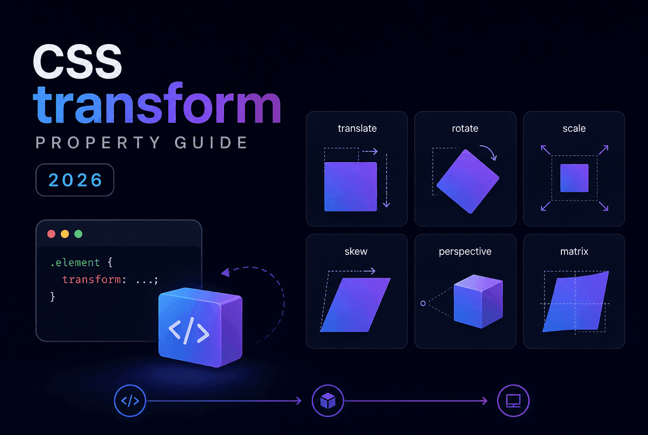
The transform property is how CSS moves, resizes, rotates, and shears elements without ever touching layout — which is exactly why it is the backbone of nearly every smooth hover effect, flip card, and modal animation on the web. This guide covers all five transform functions, transform-origin, why combination order matters, the newer standalone translate/rotate/scale properties, and a head-to-head performance comparison against positioning with top/left. A free visual generator is included so you can build any combination and copy the CSS instantly.
TL;DR
transform combines five functions — translate(), scale(), rotate(), skew(), and the low-level matrix() — to move, resize, spin, and shear an element without triggering layout. Functions apply right-to-left inside one declaration, so order changes the result. transform-origin (default center) sets the pivot point. Because it runs on the GPU compositor thread, it is the property to reach for whenever you animate.
Quick Answer
transform is a CSS property that applies geometric transformations — moving, resizing, rotating, or shearing — to an element’s rendered box, without changing where that box sits in the document flow. It accepts one or more transform functions, space-separated, and takes effect immediately without needing position: relative or any layout property.
Before transform, developers moved and resized elements with top, left, width, and height — all of which live inside the layout system and force the browser to recompute the position of every affected element whenever they change. transform operates entirely outside layout: the browser paints the element once, then hands the painted result to the GPU compositor, which can move, scale, or rotate that already-painted layer with no further layout or paint work.
This distinction is the single most important thing to understand about transform. It is not a replacement for layout properties — you still need display: flex, grid, or position to arrange elements — but it is the correct tool for any visual movement that happens after layout has already settled: hover states, entrance animations, drag feedback, and anything that needs to run at 60fps.
Sibling elements are unaffected: because transform does not participate in layout, transforming an element never shifts its siblings or parent’s size — even a scale(2)that visually doubles an element’s size leaves surrounding elements exactly where they were.
Quick Answer
CSS 2D transforms boil down to five functions: translate() moves an element, scale() resizes it, rotate() spins it, skew() shears it at an angle, and matrix() is the low-level function that all the others compile down to internally.
/* translate — move along X and/or Y */.move { transform: translate(20px, -10px);}.move-x { transform: translateX(20px); }.move-y { transform: translateY(-10px); } /* scale — resize along X and/or Y (unitless multiplier) */.grow { transform: scale(1.2); } /* uniform */.grow-warp { transform: scale(1.4, 0.9); } /* non-uniform */ /* rotate — spin around the transform-origin */.spin { transform: rotate(45deg); } /* skew — shear along X and/or Y */.slant { transform: skewX(-10deg); }.slant-both { transform: skew(-10deg, 4deg); } /* matrix — the low-level function the above all compile down to */.raw { /* matrix(scaleX, skewY, skewX, scaleY, translateX, translateY) */ transform: matrix(1, 0, 0, 1, 20, -10);}| Function | Effect | Unit |
|---|---|---|
translate(x, y) | Moves the element along X and/or Y | px, %, em, rem |
scale(x, y) | Resizes the element (unitless multiplier) | unitless number |
rotate(angle) | Rotates around the transform-origin | deg, rad, turn |
skewX() / skewY() | Shears the element along one axis | deg |
matrix(a, b, c, d, tx, ty) | Low-level function all the above compile to | unitless / px |
scale() takes unitless numbers because it is a multiplier, not a length — scale(1.2) means “120% of the current rendered size,” not 1.2 pixels. A single value scales uniformly on both axes; two values (scale(1.4, 0.9)) scale X and Y independently, which is useful for squash-and-stretch style effects but can distort rounded corners and shadows at extreme ratios.
Quick Answer
transform-origin sets the pivot point that rotate() and scale() operate around. The default is 50% 50% (the element’s exact center, also written as the keyword center). Setting it to a corner — like top left or bottom right— produces hinge-style rotations and corner-anchored zooms instead of symmetric ones.
/* Default origin is the element's center: 50% 50% */.rotate-center { transform: rotate(45deg); transform-origin: center; /* same as 50% 50% — this is the default */} /* Hinge effect — rotate around the top-left corner */.hinge { transform: rotate(-8deg); transform-origin: top left; /* same as 0% 0% */} /* Corner-anchored zoom — grows away from the bottom-right */.corner-zoom:hover { transform: scale(1.15); transform-origin: bottom right; /* same as 100% 100% */} /* Custom origin using explicit coordinates */.custom-pivot { transform: rotate(20deg); transform-origin: 30% 70%;}Think of transform-origin as pinning a thumbtack into the element before you rotate or scale it — everything pivots around that pinned point. translate() and skew() are unaffected by transform-origin; only rotate() and scale() (and matrix() when it encodes rotation or scale) respect it.
A common pattern is a 9-point origin grid — the four corners, the four edge midpoints, and the center — which covers the vast majority of real-world use cases: hinge menus (top left), corner-anchored zoom-on-hover cards (a specific corner), and centered pulse/scale effects (the default center). The CSS Transform Generator below exposes exactly this 9-point grid as a visual picker.
Quick Answer
Multiple functions inside one transform declaration apply right-to-left, and each function operates in the coordinate space left behind by the one before it. translate(40px, 0) rotate(8deg) rotates first, then translates along the now-rotated axis — a different result from rotate(8deg) translate(40px, 0), which translates first and rotates around the original origin.
/* Order matters — transforms apply right to left */.card-a { transform: translateX(40px) rotate(8deg); /* rotates first, THEN translates along the now-rotated axis */} .card-b { transform: rotate(8deg) translateX(40px); /* translates first, THEN rotates around the origin */ /* Same two functions, visibly different result */} /* Practical pattern: hover lift + scale, order-safe because translate and scale don't rotate each other's axis */.hover-card { transition: transform 200ms ease-out;}.hover-card:hover { transform: translateY(-6px) scale(1.02);}This is the single most common source of “why isn’t my transform doing what I expect” bugs. When only translate and scale are combined the order usually does not matter visually, because neither rotates the other’s coordinate system. The moment rotate()enters the mix, order becomes significant — a rotated element’s local X/Y axes are tilted, so any translation applied after the rotation moves along the tilted axes rather than the page’s horizontal/vertical axes.
Rule of thumb: if you want a translate to happen along the page’s normal horizontal/vertical axes regardless of rotation, put translate() first (rightmost) in the declaration, so it is applied before the rotation bends the coordinate space.
Quick Answer
Since 2021, all major browsers also support translate, rotate, and scale as standalone CSS properties — separate from the transform function shorthand. Each can be set, transitioned, and overridden independently without touching the others, which the combined transform string cannot do.
/* Modern CSS (2021+): translate, rotate, and scale as independent properties, each animatable on its own */.box { translate: 20px 0; rotate: 8deg; scale: 1.1;} /* Longhand transform requires the whole string to change even if only one value is different: */.box-legacy { transform: translate(20px, 0) rotate(8deg) scale(1.1);} /* With standalone properties, a hover state can change just one value without touching the others: */.box:hover { scale: 1.2; /* translate and rotate stay untouched */} /* Note: transform (if also set) always applies AFTER translate/rotate/scale in the render order */This solves a real limitation: with the classic transform shorthand, if an element has transform: translateX(20px) rotate(8deg) and a hover state needs to add scale, you must repeat the entire string — transform: translateX(20px) rotate(8deg) scale(1.1) — because setting a new transform value replaces the old one entirely. With standalone properties, a hover rule can set just scale: 1.1 and leave translate and rotate untouched.
If both the standalone properties and transform are set on the same element, translate, rotate, and scale apply first (in that fixed order), and transform applies after. Browser support has been solid since 2022, so for new projects the standalone properties are worth defaulting to when you need independent control over each transform channel.
Quick Answer
transform is GPU-composited and never triggers layout, making it the correct choice for anything animated. top, left, and marginare layout properties — the browser recalculates the position of the element (and potentially its siblings) on every single frame they change, which is measurably slower and can cause visible jank.
/* Animating position — triggers layout on every frame */.card-slow { position: relative; left: 0; transition: left 200ms ease-out;}.card-slow:hover { left: 20px; } /* Animating transform — GPU-composited, no layout cost */.card-fast { transform: translateX(0); transition: transform 200ms ease-out;}.card-fast:hover { transform: translateX(20px); }| Aspect | transform | top / left / margin |
|---|---|---|
| Triggers layout recalculation | No | Yes |
| GPU-accelerated / compositor-only | Yes | No |
| Affects sibling elements | No | Sometimes (margin collapses, reflow) |
| Safe for 60fps animation | Yes | Risk of jank |
| Needs position: relative/absolute | No | top/left do |
| Best use case | Animation, hover states, transforms | Static layout, initial positioning |
This does not mean top/left/margin are wrong to use — they are exactly what layout properties are for, and static positioning has no performance cost since it only runs once. The rule is specifically about animation: if a value changes repeatedly (on hover, on scroll, in a loop), reach for transform; if it is set once and stays put, layout properties are perfectly fine.
Pros
Cons
/* Classic hover flip-card pattern built entirely with transform */.flip-card { perspective: 800px; } .flip-card-inner { transform-style: preserve-3d; transition: transform 500ms ease;} .flip-card:hover .flip-card-inner { transform: rotateY(180deg);} .flip-card-front,.flip-card-back { backface-visibility: hidden;} .flip-card-back { transform: rotateY(180deg);}Best for
rotateY() and backface-visibilityanimation-timelinetransform-originThe flip-card pattern above combines three ideas from this guide at once: perspective on the parent for 3D depth, rotateY(180deg) on hover for the flip itself, and backface-visibility: hidden so the reverse side of each face does not show through during the rotation. For a dedicated 3D pivot — perspective, rotateX/Y/Z, and translateZ — see the CSS 3D Transform Builder.
Reading the spec is one thing; feeling how translate, scale, rotate, and skew interact is another. The CSS Transform Generator on CSSAWWWARDS is a live demo of everything covered above — drag sliders for each function, pick a transform-origin from a 9-point grid, and watch a preview card update in real time. Only non-default values are included in the CSS output, so what you copy stays minimal.
Nine presets — slide, zoom in/out, rotate, flip horizontal/vertical, skew, and pop — give you a working starting point to tweak rather than building every combination from scratch. Once your element also needs to animate between states rather than just sit in one, pair it with the CSS Animation Generator covered in our companion guide.
transform is the single most important property for motion in CSS — not because it does anything visually unique, but because of how it does it: entirely outside the layout system, on the GPU compositor thread, with zero cost to sibling elements. Once translate, scale, rotate, and skew feel natural, the two habits worth keeping are watching combination order whenever rotation is involved, and reaching for transform (or the standalone translate/rotate/scale properties) instead of top/left/margin for anything that animates.
To turn a static transform into a full timeline — looping, multi-step, or with a custom easing curve — see our companion guide on the CSS Animation Shorthand, or the deeper CSS @keyframes Animation Builder guide for multi-stop sequences.
Share this article
