A working checklist, not a spec dump: 20 CSS features grouped into layout, cascade architecture, color, typography and sizing, motion, and utility — each with a one-line explanation, a copy-paste example, and a note on how safe it is to ship today.
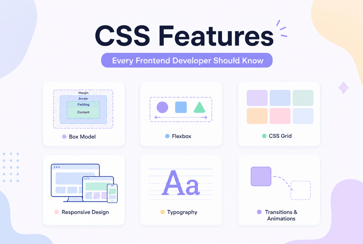
TL;DR
The 20 features below fall into six groups: layout (container queries, :has(), subgrid, Grid, Flexbox gap), cascade architecture (@layer, nesting, @scope), color (OKLCH, color-mix(), relative color), typography/sizing (clamp(), logical properties, text-wrap: balance), motion (View Transitions, scroll-driven animations, :focus-visible), and utility (custom properties, aspect-ratio). Most are Baseline widely available and safe for production today.
| # | Feature | Category |
|---|---|---|
| 1 | Container queries | Layout |
| 2 | :has() selector | Layout |
| 3 | Subgrid | Layout |
| 4 | CSS Grid | Layout |
| 5 | Flexbox gap | Layout |
| 6 | @layer cascade layers | Cascade |
| 7 | Native CSS nesting | Cascade |
| 8 | @scope | Cascade |
| 9 | Cascade layer ordering | Cascade |
| 10 | OKLCH color space | Color |
| 11 | color-mix() | Color |
| 12 | Relative color syntax | Color |
| 13 | clamp() fluid sizing | Typography |
| 14 | Logical properties | Typography |
| 15 | text-wrap: balance | Typography |
| 16 | View Transitions API | Motion |
| 17 | Scroll-driven animations | Motion |
| 18 | :focus-visible | Motion |
| 19 | CSS custom properties | Utility |
| 20 | aspect-ratio | Utility |
Use this as a self-assessment: if more than a handful of these are unfamiliar, the sections below cover each one with a short explanation and a working code example.
Quick Answer
Container queries, :has(), and subgrid solve problems Grid and Flexbox alone cannot: responding to a parent’s size, selecting by relationship, and aligning nested grids — while Grid and Flexbox remain the two foundational layout systems everything else builds on.
/* 1. Container queries — respond to a parent's size */.card-wrapper { container-type: inline-size; }@container (min-width: 400px) { .card { display: grid; grid-template-columns: 120px 1fr; }} /* 2. :has() — relational "parent selector" */.form-group:has(input:invalid) { border-color: #e44; } /* 3. Subgrid — nested grid inherits parent tracks */.child { display: grid; grid-column: span 4; grid-template-columns: subgrid; } /* 4. CSS Grid — two-dimensional layout */.gallery { display: grid; grid-template-columns: repeat(auto-fill, minmax(220px, 1fr)); gap: 20px; } /* 5. Flexbox gap — spacing without margin hacks */.toolbar { display: flex; gap: 12px; }Container queries let a component adapt to its parent’s width instead of the viewport’s, making the same card component work correctly in a wide main column or a narrow sidebar. :has()is CSS’s first true relational selector, enabling styling based on descendants or siblings that previously required JavaScript.
Lets a nested grid inherit its parent’s column or row tracks, keeping nested components (like card titles across a row) pixel-aligned without duplicating track definitions.
Grid remains the tool for two-dimensional layout; gap (now supported in both Grid and Flexbox) replaced margin-based spacing hacks for the space between items in either system. For the full decision framework between the two, see our CSS Grid vs Flexbox decision guide.
Quick Answer
@layer, native nesting, and @scope give CSS the architectural tools that used to require a preprocessor or a CSS-in-JS library: explicit cascade ordering, nested selectors, and DOM-scoped styles.
/* 6. @layer — explicit cascade order */@layer reset, base, components, utilities; /* 7. Native nesting — no preprocessor required */.card { padding: 16px; &:hover { box-shadow: 0 4px 12px rgba(0,0,0,0.1); }} /* 8. @scope — limit a rule's effect to a DOM subtree */@scope (.widget) { a { color: inherit; } /* only affects links inside .widget */} /* 9. Cascade layer ordering wins over specificity */@layer utilities { .text-red { color: red; } /* beats any un-layered or earlier-layer rule */}Cascade layers let you declare a fixed priority order once, so utility classes always win over component styles regardless of specificity or source order — ending the “just add another class” specificity arms race. See the full Cascade Layers guide for the layer-order-vs-specificity rule and the !important reversal.
Nest selectors, pseudo-classes, and media queries directly in plain CSS with the same &syntax Sass popularized — no build step required.
Limits a rule’s effect to a specific DOM subtree, which is exactly what a component library or embeddable widget needs to avoid leaking styles into (or being affected by) the host page.
Quick Answer
OKLCH is a perceptually uniform color space ideal for generating consistent color scales; color-mix() blends colors directly in CSS; relative color syntax derives new colors from existing custom properties without a preprocessor function.
/* 10. OKLCH — perceptually uniform color */.brand { color: oklch(65% 0.2 150); } /* 11. color-mix() — blend two colors in any color space */.hover { background: color-mix(in oklch, var(--brand) 80%, white); } /* 12. Relative color syntax — derive from an existing color */.lighter { background: oklch(from var(--brand) calc(l + 0.15) c h); }These three work together in modern design-token workflows: define a brand color once in OKLCH, then derive hover/active/disabled states with relative color syntax or blend it toward white/black with color-mix() — all without a Sass color function. Try it with the Color Format Converter.
Quick Answer
clamp() replaces breakpoint-based font-size overrides with smooth fluid scaling; logical properties make spacing and borders automatically RTL-safe; text-wrap: balance evens out heading line lengths without manual <br> tags.
/* 13. clamp() — fluid, breakpoint-free sizing */h1 { font-size: clamp(1.75rem, 1.2rem + 2vw, 3rem); } /* 14. Logical properties — direction-agnostic, RTL-safe */.card { margin-inline: auto; padding-block: 24px; } /* 15. text-wrap: balance — evens out heading line lengths */h1, h2 { text-wrap: balance; }clamp() alone eliminates most of the 3–5 breakpoint-specific font-size overrides a typical design system used to need. Calculate one without doing the math by hand using the CSS Clamp Calculator.
Quick Answer
The View Transitions API animates DOM/page-state changes without a JS animation library; scroll-driven animations tie a keyframe animation’s progress to scroll position with no scroll listeners; :focus-visible shows focus rings only when appropriate (typically keyboard navigation).
/* 16. View Transitions API — animated DOM/page-state changes */document.startViewTransition(() => updateDOM()); /* 17. Scroll-driven animations — no scroll listeners needed */.reveal { animation: fade-in linear both; animation-timeline: view();} /* 18. :focus-visible — focus rings only when they should show */button:focus-visible { outline: 2px solid var(--color-accent); }All three remove JavaScript that used to be unavoidable: a page-transition library, a scroll-position listener with requestAnimationFrame, and a JS-based “was this triggered by keyboard or mouse” check. See the full View Transitions API guide for shared-element zooms and cross-document navigation, and the CSS Animation Shorthand guide for the animation property mechanics these features build on.
Quick Answer
CSS custom properties are live, JavaScript-readable variables that update at runtime for theming and dark mode; aspect-ratio replaces the classic padding-top percentage hack for maintaining a fixed width-to-height ratio on responsive elements.
/* 19. CSS custom properties — live, JS-readable variables */:root { --brand: #1D9E75; }.button { background: var(--brand); } /* 20. aspect-ratio — no more padding-top percentage hacks */.video-embed { aspect-ratio: 16 / 9; }Unlike Sass variables, custom properties are resolved by the browser at runtime, participate in the cascade and inheritance, and can be read or updated from JavaScript — making them the foundation of nearly every modern dark-mode and design-token implementation.
If you only have time for 5
:has() selector — eliminates a surprising amount of JS-for-styling codeclamp() — the highest ROI single line for fluid typography and spacingPros
Cons
The fastest way to internalize any of these 20 features is to build with it immediately. CSSAWWWARDS has a free, no-signup tool for most of the layout, color, and motion features covered above.
None of these 20 features are exotic or experimental in 2026 — they are the baseline expectation for CSS written by developers who have kept up with the platform over the last few years. The fastest path to fluency is not memorizing all 20 in one sitting, but recognizing which JS workaround or Sass function you currently reach for out of habit, and checking whether the platform now does it natively.
For deeper dives on individual features, see the Complete Guide to Modern CSS, the CSS Container Queries guide, and the CSS :has() Selector guide.
Share this article
